Portfolio - Lotuses
- jesskesson
- Jun 20, 2020
- 6 min read

During the Synoptic Project, I did a lot of research into Asian culture and fashion, which led me to wanting to draw more images in the same style. However, I decided that the style I used during the Synoptic Project wasn't the one I was used to and most comfortable with, so I decided to try a style similar to how I draw on paper.
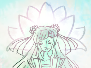
My inspiration for this drawing came from the colours of lotus flowers, and how I wanted to incorporate all of them into an image together. Thus, I came up with the rough idea of creating a lotus spirit or deity, surrounded by lotuses.

I had the idea early on that the image would be of a lotus spirit, and two others in the image. Because lotuses can symbolize rebirth, I decided to try and represent this by depicting the lotus spirit's reincarnations.


I started out by drawing a brief layout of the image. I planned to have the lotus spirit in the centre and her two reincarnations on either side. When it came to designing the lotus spirit, I tried to give her some clothes that would look like a lotus flower. This meant I flicked the shoulders of her jacket up, and also shaped her waist skirt into the shapes of petals.
Something that I planned from the beginning was for all three of them to have twin buns on their heads, which would be shaped like lotuses. I think this helps unify the three of them, as it's somewhat unclear as to what the meaning of the image is.
I decided that the first reincarnation I would portray as an elderly woman, which I dressed in Han Dynasty inspired clothing. I decided against giving her a fringe, and instead pulled her hair back into two buns. I felt that this suited her age better, and also allowed me to give her more wrinkles and detail on her face.
I decided that the second reincarnation would be a younger girl, maybe a teenager, from the current time. This meant I had to give her a completely different style than the previous two, which I worried would look too out of place. I gave her a simple jumper, some ripped jeans and headphones to convey what time period she's supposed to be from.
In the background, I knew I wanted lotuses. My original idea was to have a bud above the first reincarnation, a blooming lotus above the spirit, and a wilting lotus above the second reincarnation. However, I felt that this didn't fit with where I'd put the two incarnations, so I scrapped that idea. I did, however, give the lotus spirit a motif being her head. I also draw some lotuses in the background, and two in front of either of the incarnations. The original idea was to surround the lotus spirit with flowers, and I felt that this would also help with the layout of the composition and accentuating the three ladies in the image.


Once I'd finished the initial sketching and planning, I moved onto lining the components of the image. I originally lined the ladies with dark green, with a very fine brush. I liked the way this looked at first until I drew in the lotuses in the background. I decided to lighten the green I used, and thickened the brush to mimic Chinese and Japanese paintings. Because of this, I felt that the thin lines I used clashed too much.
While relining the ladies, I Tried hard not to lose detail, as the thicker lines made it harder to add all the intricate details I'd had in the previous attempt. I preferred this time lining them, however, as it felt more like my style, since my drawings often come out mess, with extra lines to describe the shape of something. The thicker lines also made the whole image seem more relaxed and carefree, which goes along with the symbolism of lotus flowers well.


With the outlines finished, I moved onto colouring the background. Originally, I started colouring with the idea that I would block out the different colours to see if everything looked okay, but I ended up loving the colours a lot, so I decided to roll with it.
This was the best decision I made, as it gave me the chance to be experimental, without focusing all my energy on getting everything perfect. I used green as the base background colour, and painted pink and blue for the lotuses on either side of the image. I painted both sides seperately, as I wanted a messy, watercolour effect.
I made the front two flowers slightly transparent, so that the designs for the two incarnations were visible. I decided to give the two of them opposite colours to the flowers around them, as I felt having all blue on one side and all pink on the other would cause them to be lost in the background. The lotus spirit, I decided, would be green to contrast from the other two.

With the basics of the composition done, I started experimenting with the lighting of the image, and adding a sparkle and ethereal mist to it. I first added a trail of pink around the image, and then trailed blue around, following the movements. I tried to mimic the movement of water, since lotuses grow in shallow waters.


The next thing I did was slowly build up the rest of the composition. Since I didn't have a full plan, I jumped back and forth a lot while adding in new layers. I decided that the next most important thing to do was add some shading to the ladies in the image. I added some reflection on either side of the lotus spirit, which adds more colour to the image.
I started working on the background again, and adding more light layers to it to create a more interesting background instead of the block colours I originally had. It gave the background some turquoise, which wasn't my original intention, but I like how it looked so I decided to keep it as is.
I also added a layer of blue and pink behind the lotus spirit's head, and then another layer of glow, which gave her a more ethereal look, and also separated her from the background.


I added more glow around the other two ladies where they overlapped with the lotus spirit in the centre, and also added reflections. These reflections are done with the opposite colours, and also match the ones I gave the lotus spirit, which ties the image together.
I had some more fun with experimenting with different layers on top of the composition, which I set to different layer settings to give different effects. I decided that at this point I was happy with the image except for the openness of it. To me, it still didn't feel like it had much dimension to it, so I added a final layer of green, which I used to soften the edges of the composition. I think this gives a really nice effect, and solidifies the entire image.

These are the groups I had at the end of the project, which was far more than I expected. Each of these groups had many layers in them, and many others that I used to experiment with different layer effects.

This is the finished image. I had a lot of fun with this project, as it gave me a chance to be completely spontaneous. In the Synoptic Project, I had to be very methodical about how I created images, but it was the complete opposite with this image. Instead, I was playing around with the background while colouring the characters.
This project also helped my become more comfortable with Photoshop, and allowed me to experiment with various different brushes and styles without being limited to only one. Overall, this image was a great of testing out and playing around with Photoshop, which has definitely helped with my confidence when it comes to the software.
If I could draw this again, I would definitely try adding some yellow into the pallet, as there isn't a lot of warm colours being used, and some yellow would definitely brighten the image up. I would also experiment with a thicker brush to fully mimic the painting styles of Japan, which doesn't come across as much as I had hoped it would. I still need to do a lot of experimenting in Photoshop before I feel comfortable with it, but I feel as though I'm making good progress.


Comments