Creating a Poster in Photoshop
- Jan 17, 2021
- 7 min read
Updated: Jan 18, 2021
As part of the Professional Practice unit, part of the criteria was to create a poster. Having previously designed the poster, I decided that I'd try to create an epic cinematic poster.


Here are the images I took that will be used later on. The pictures in costume were the most interesting, as I had to dig out all the clothes to wear as the three different characters. I had a blast coming up with ways to distinguise the three characters, and decided that the easiest way to do this would be with colour.
I ended up having to model with a Nerf Gun, since that was the closest thing in the house to a revolver.
I also went outside and took some pictures of some stones in my garden. These weren't very big, so I had to play with the angle of how I was taking the pictures to make them look like imposing cliffs.


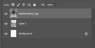
I started by creating a Photoshop Document to the size listed in the brief, and then set up some guides to help me later. I added in the sketch of the poster I'd done prior and moved it around until I was happy. I also made a displacement map, but I didn't end up using this. If I had, it would've been on the sky to give it more of a faraway look.


I then went into After Effects to create a lens flare. I then saved the frame and changed the layer type to Linear Dodge (add) so that it acts as a reflection bouncing off a window.


I then brought in the sky image and started creating masks to use later when creating the cliffs. This was before I'd taken pictures of the stones, so I didn't end up using these either. They were useful in helping me position the cliffs later, and also when creating the tower.


I added a curves layer to the sky and applied to look moer sunset. Since the light from the lens flare is supposed to be coming through a window, the setting of the poster is in sunset.


I then started embedding the images of the characters in. I started with the hero, and then added the villain and flipped them horizontally to match the hero.


It was then a case of using the magic wand tool to cut them out onto new layers. I had to pay close attention to the gun and smooth out some of the edges around the right arm. Once I was happy with the selection, I added a small feather to the selection and then pressed Ctrl and J to paste the selection to a new layer.


I did this again for the villain, which was a little easier to select because of the dark coat I was wearing in the photo.


With both of them cut out, I applied some curves layer to them to change the lighting. Since I took these pictures inside in tungsten lights, the lighting is a little yellow. I made it a bit more red to keep with the sunset theme.


I added some shading around the sky to add more of a vignette to it to add a bit more darkness to the sky. I also added in the third character; the sidekick. I did the same process as with the other two characters, but applied it instead as a layer mask to experiment with later.


I inserted a layer of black to the bottom of the poster to add the billing block onto. To create the billing block, I used a WordPad document to create the text and font in different sizes, then took it into MS Paint to move around the words more precisely. Once I was happy with it, I placed it as an imbedded image, which fit into the space I had left for the text perfect.
I then went back to the characters and upped the contrast to make them more dynamic.


Moving onto the background, it was time for me to edit the images of the stones. I started by bringing all of them in, and then using the magic wand tool to select as much of it as I can before going into the selection menu and selecting everything else.


I did the same for this stone, which is just the previous one flipped round. I had to use the precision brush because of the moss growing on it. I decided that from a distance it looked like wildlife, so I decided that this would be the cliff face in the middleground.


Finally, I moved onto creating the final mountain. Because this one is far tall than the other two, I decided this one would be the back mountain.


With all of them cut out, I duplicated and flipped them over to position them as cliffs.


Since the back mountains are far away, I tried to incorporate some atmosphere colouring to them. I started with a pale blue, and then added a brighter blue on top and masked then both to stay on the mountains.
I also made the foreground cliffs darker to add a bit of contrast between all of the different layers.


To differentiate them more, I added Gaussian Blurs to the background mountains and to the foreground cliffs. I left the middleground alone.


I decided to rotate and use one of the stones to texture the tower mask I had made earlier. I changed the contrast and colours of it so that it didn't match the rest of the environment.
Another thing I did was switch out the image I had been using as the sky for a better image from the same day. I also added a small layer of orange and red to make it look more like a sunset sky.


I then duplicated the tower and darkened it to add as a shading layer on top. To make the tower look 3D, I added a mask to the shading layer and used a soft brush to eliminate the sides of the tower gradually to create the illusion of a curve.

Here's how the poster's looking so far. I started adding some lighting and shading layers to the characters in orange and blue, which help blend them more into the environment. I also shaded the cliffs to show the differences between them all, and added orange highlights at the peaks.


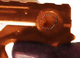


Next, I head in closer for more detail. I decided that I wanted to change the colour of the guns the characters are holding. The original plan had been to use a render of my textured revolver model, but due to time constraints and not having the programmes needed to do this meant this is my only option.
I started with the hero's gun, which I cut out onto a new layer and coloured orange. I also added a higher contrast to it to make it look metallic. I used the patch tool to get rid of the Nerf logo.
I decided I didn't like the white lines on the gun, so I added a quick layer of brown on top of them, feathered it, and then set it to multiply.


I then did the same with the villain's gun, but turned it black instead. I also changed the colour of her hat to black in the same way, which sets her more apart from the other characters.
Her face is hidden by the hero's revolver, because my original intention was for her to be a shadow of them, which is the concept I designed the poster with originally. Now that the guns don't look like toys, this is far more noticeable.


I added a feather to the tower so that it was too sharp, and then started playing around with more shading and lighting layers. I added brighter colours to both the background and characters, making sure include the tower as well. Because of the texture, the tower now looks crystalline, which is something I never considered but absolutely love now. I erased part of the shading layer of the tower to look like a window, which helped give the flare more foundation, as it looked a little out of place.
I also smoothed out the mask on the sidekick, which had a few odd bumps in it. With that, I duplicated all the layers and merged them into one to work on the final parts of this poster.


I used the circular marquee tool to mark out where I wanted a vignette to go, and using the 'add to selection' option, I was able to incorporate another oval into it to include the sidekick.
I inverted the selection and added a gradient of orange and blue to it. I then feathered the layer to smooth it out and set it to multiply.


The only thing left to do is add in text for the title. I originally tried to create the title in Times New Roman, but I didn't like how that looked, so I instead matched the way I created the title in the design. I used Copperplate Gothic Light for the font, and used different sizes. 250 was the largest, then 180, then 120, and finally 100 for 'The.'
I stretched out 'Tower' so that it fit the space better, and made sure all the words were level before I decided the poster was completed.

This is the finished poster. This image is half the size of the original, since tat one was too big to be put here. Overall, I'm incredibly pleased with the results of the poster. However, I can see a few issues with the masks on the characters. This is an issue that I knew would arise, but I also knew there wouldn't be much I could do.
During the creation of this poster, I was in constant fear the program was going to crash due to the size and amount of layers. Everything I did I had to carefully do so as to not crash Photoshop. Despite this, I managed to work around it and created something I'm proud of. If I hadn't been at constant risk of losing work, I definitely would've gone back and really fixed the edges of the characters and their masks.
If I could create this poster again, I think I would try and go with something more minimalist, which would really work with the dynamic poses I incorporated into my design.


Comments