Creating Interesting Text in Photoshop
- Oct 19, 2020
- 3 min read
Another essential skill to creating a good poster is to have text on their to inform the viewer exactly what it is they're looking at. In my initial drafts of my poster, I had a go at this as well, but knowing how to do this in Photoshop will make this far easier.
I vaguely followed a tutorial by Paul Trani, but did my own things along the way. I felt this was a better way for me to become more comfortable with Photoshop.

I started by downloading this image and imbedding it into a new Photoshop document. This is the image I'll be putting text onto.


I typed in some simple woods to play around with, using the various settings Paul Trani went over in his tutorial. I had the idea of weaving the words behind the trees, so that's I what I set out to achieve.


The next thing I did was convert all the text layers into smart objects so that they don't pixelate and maintain their aspect ratio. I then distorted the text and positioned it. In the tutorial, the text was warped to line up with buildings. Since I picked a forest to use as a test, I decided to distort it upwards.


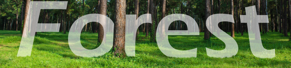

I then added masks to the text to hide part of the letters behind the trees. To make this quicker, I used the marquee tool to outline the tree. I then inverted the selection and deleted it on the mask layer.
I then went in for more detail, and painted the trunk of the tree more accurately. I painted out the bottoms of the letters so that the word looks like it's resting on the ground.


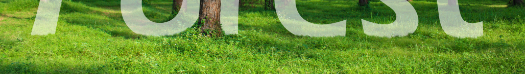

I went into a bit more detail with this, and used a smaller brush to brush in more blades of grass. I didn't spend long on this, so I just made sure it was convincing from a distance.


I then masked out the other two woods in the same way. I decided I would loosely base my image off of The Blank Signature by Rene Magritte, a surrealism painter.
I decided to have a bit of fun with this and added a small S-curve the curves menu. This really upped the contrast between the lights and darks of the image, which really makes it pop.

Here's how the image looks so far.


I decided to add another curves layer to the composition, this time pushing the reds of the image out.


I then went in and created some shading for the text as it disappears behind the trees. Once I was happy with how I'd shaded it, I copied the different masks on the text to shading to make sure they matched.


I had another quick go at distorting the text in different directions, which helped me feel more comfortable with the tool.

I decided to get a flare off the internet to use as a screen layer over the top of the composition. I felt that I was important for me to do this to keep the memory of how to do this fresh in my mind.

Here's 'version 1' of the image.


I quickly turned the saturation up on the image to play with more with the contrast of light and dark. Following along with the tutorial, the next step was to make the text appear to be 3D. To do this, I went into the layer menu for the text and went into the drop shadow and ticked the box. I then turned the spread and size down to 0 to eliminate the glow effect it gives. I then changed the colour of the drop shadow and rotated it around to fit in better with the direction of the perspective warp.
I then did this to the other two text layers. I did all this on duplicate layers increase I needed to make any changes. The last thing I did was try out a gaussian blur on the text layers.


Here's how the finished image looks. The first is unblurred, the second is with the blur. Because the radius was 1.0, it's barely visible, but it helps the text not be too starkly different from the blurrier woodland scene.
This exercise has been incredibly useful, and has also helped me become more comfortable with tools in Photoshop I've only recently started using, like layer masks and curves layers. This will definitely be useful for me to use when creating my poster.


Comments