Photoshop - An Introduction to Photo-bashing Part 1
- Sep 28, 2020
- 5 min read
The second task of the Professional Practice unit involves using Photoshop to create a movie poster to go along with the essay. This poster will be photo-bashed together, which is something I've never tried to do in Photoshop.
Thankfully, we were given a quick tutorial on how to do numerous things to create a convincing image from multiple photos.


The first thing we did was download all the images. To make sure I got the highest resolutions, I couldn't just save them. Instead, I had to make sure I'd fully downloaded them to get the right dimensions.


Once the images were saved, I created a new photoshop document with the same size as the image of the girl on the cliff. Once the image was in, I added in guidelines to use later. This will help a lot with getting the composition right, as it needs to be balanced.
The plan was to erase the background and replace it with the mountain view above. So I used the magic wand tool and clicked on the background. As it was a good image, it recognised the girl and selected her. However, I needed to have the rock selected as well, so I clicked on 'Select and Mask..' on the top bar, which took me into a menu that would allow me to go in and select the rocks.


In this menu, the selection is separate from the rest of the image, so I turned down the opacity to get a better idea of what is and isn't selected. I went around with the select tool and added in the rocks, making sure not to include the sky.
Once I was happy with the rocks, I went and selected another tool on the left of the screen. This one is used for precision, and is programmed to pick up on things like hair against a background. So I dragged it over her hair a few times, and it weeded out anything of the sky. I tried to use this on the rocks as well, but it ended up incorrectly detecting their edges and leaving holes. So I had to go back over the rocks to fix them, but I'm glad I did, since they ended up far cleaner.


With the selection complete, I pressed control and J to copy it onto a separate layer. This way, if anything goes wrong, I still have the original image. Now all I had to do was add in the mountain view and size it into position. I made sure the mountains were in a place where they matched.


Now that the main background is complete, it was time to use the stone texture to create a planet to place in the background. I opened a new photoshop document with square measurements so that I would be able to create a perfect circle. With the document set up, I brought in the stone floor texture and sized and positioned it so that the most interesting parts were visible.
Using the circular marquee tool, I set it to the same size as the the canvas size. I then went to the FX tool down under the layers panel and gave the selected area a 3D warp so that I can use it as a moon in the main composition.


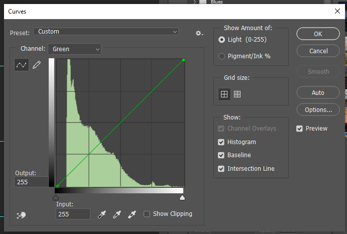
Before I brought the moon in, I opened the image of the birds in a separate document and went into the curves adjustment menu to up the contrast and only have silhouettes. I did this by sliding the black up and the white down. Once I was happy with the contrast, I used the magic wand tool to select the bird, copies them onto a new layer, and then brought them into the main composition.
I then turned them into smart objects so they didn't pixelate and had fun sizing it and moving into a good position. I copied the layer and added more birds further back to give the image more depth.


I moved them around a bit before I found a good position for them. I decided to have them going in an arch from the side of the image. I didn't get this perfect, but it's convincing enough.


The next thing I did was select the moon layer and added a gradient layer in the adjustments menu. I made the gradient circular, and moved it to the top left of the moon to make it look more 3D. I added a second gradient of white to give it more of a shine.
I then selected the moon to get its size, created a new layer and filled it with white. I moved the selection two taps to the right and up, before reselecting the moon, going to the white layer and erasing the selection to only have a sliver to peak behind the moon.


I coloured the crescent orange on a screen layer before duplicating the layer seven times, labelling each of them according to the size of the gaussian blur I used on each of them. I started at 200, and halved it until I got down to 3. I creates a really convincing glow to the moon, and also taught a new trick for getting a glow on an object.
With the glow done, I added in the flare and set the layer to screen so that the black background wouldn't be visible. I added a mask layer and gently painted out the sharp edges of the flare to help it sit better in the image.


I opened the curves menu to plan out how I wanted to change adjust the colours in the image later, and then went into the layer styles menu and went into the blending options menu. I dragged the slider up to lighten the image, and then held down Ctrl to split the slider in half and drag it back down.
This makes the image more dynamic, as there's a greater contrast between the lights and darks, which better matches the rest of the image.


The final things I did were create an oval marquee and rotate it in the direction of the moon with the woman in the selection as well. I then pressed Q to highlight what wasn't selected in red, and then blurred it with the gaussian blur. Once I was happy with this, I inversed the selection and darkened it to create a vignette for the image.
Now all that was left to do was adjust the colours in the image. I pushed the red up quite a lot, as I like the idea of this image being of a solar eclipse. The final thing I did was add grain from the noise menu to a top layer and then set it to screen layer. I did this because the background layer used was grainy, and yet none of the other images matched.

This is the finished image. Overall, I've learned a lot from just creating this, and most of the skills I've used will be helpful in creating a poster for the Professional Practise brief. I still need to use some of these skills again to be more comfortable with them.
It surprised me just how easy it is to create something so convincing. I expected it to be far harder to achieve something like this. There were still a few things I didn't get right, but other than the few flaws, I feel I did very well with this task.


Comments