Photoshop - An Introduction to Photo-bashing Part 3
- Oct 7, 2020
- 7 min read
As a final composition exercise, I followed a video tutorial about how to create an image in Photoshop, using only three images.


Here are the three images I used. The first thing I did was download the three images, which are of a wood texture, a man's face made from a mould, and a dark water texture.


I opened Photoshop with the same measurements of the previous two compositions (2000 x 3000), and embedded the image of the man's face. I then embedded the wood texture in the same way, and sized it up and rotated it to fill out the entire canvas.


I made further adjustments to the wood texture. Since there was a blemish on the wood that was in an awkward part of his face, I used the Patch Tool and selected the area I didn't like. I then dragged it down to match the pattern of the wood below it, which blends in almost seamlessly.


I then duplicated the documents to turn the image of the man into a black and white image after rasterizing it. I then opened the curves menu and pushed the shadows of the image down to create more of a contrast.
Since I only need the contours of his face, I added a Gaussian Blur with a radius of 12.0. I then saved it as a separate Photoshop file called 'Displacement Map'.


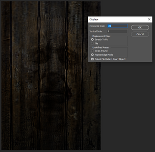


Back in the original Photoshop image, I converted the wood texture back to a Smart Object (which stops it from pixelating when re-sized). I then went into the Filter Menu and selected the 'Distort' option, and then 'Displace'. I then selected the displacement map image, which distorts the wood texture according to the contours of his face. I played around with this for a bit before finding a good balance between the two. I kept the wood texture on a screen layer so that I could see what the face looks like with the distortion.
I then made a copy of the wood texture, and set it to -25, which reverses the displacement the other way. This will help to describe the curves of the face better. I then used the marquee tool on half of the image, and added a mask layer, which cancels out all that was selected.


I then held down Ctrl and Alt and dragged the mask layer to the other wood layer, which copies and applies the mask to it instantly. I then pressed Ctrl and I to invert the mask, which split the displacement in half.


I then copied the face layer, brought it to the top and set it to soft light, which gives a nice overlay to the wood layers below it.


Turning off all the other layers, I used the pen tool to draw around his face to make an accurate selection. I first went round roughly, before going back and adjusting the curves with the anchor points. I got rid of the ears, since they weren't quite close enough to be in focus.
I then right clicked on the mouse and selected 'Make Selection,' which turns everything inside the path I drew with the pen tool a marquee'd selection. I added 5 pixels of feathering around the edges to make it smoother.


I then selected the inverse so that the background was selected, turned on the visibility of the other layers, and create a new layer on top. I made sure the colour I was using was black, and pressed Alt, Delete and Backspace to fill the new layer with black according to the feather.
Since he needed to look like he was fading into the background, I selected a soft brush and painted out the edges of his face on a new layer. I made sure to pay attention the the shadows on his face and enhance them instead of just adding shade for the sake of shade.
For future Photoshop projects, it's possible to change how a texture looks if it's a smart object. Because I made the wood a smart object, I could double click it to open it in its own Photoshop document, resize and save it. This'll be a good technique to use if I don't like how something looks.
I resized the wood texture, which makes it far smaller and more compact. I liked it more like this, so I decided to keep it. The last thing I did was press Control, Alt, Shift, and E to merge all the layers onto a new blank layer.


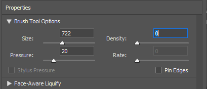
I then went into the liquify menu with the merged layer, and carefully brushed the lines on the wood on his scalp inwards, and the ones on his chin downward. I made sure to keep the size and pressure relatively low, and made sure the density all the way down.


Once I accepted the liquify, I created a new layer and called it depth of field. I used a bright coloured brush to paint up the contours of his face. I used a brush at opacity 10 to gradually build up the the clearest parts of his face. The bright the area is, the more in focus it's going to be. Because my brush was somewhat firm, I added a small Gaussian Blur to the layer and added more brush strokes to it.
I then locked the transparency of the layer, and pressed Alt Delete, which turns the layer from neon green to white. The depth of field needs to be white in order to work, so this is perfect.


I unlocked the transparency of the layer, created a new layer and filled in with black, and then merged the two together. I then pressed Ctrl + A to select the entire thing and Ctrl + C to copy it. I then went into channels, added a new channel, and pasted the layer there. I renamed this channel 'Depth.'
I then went back to the merged image of the wooden man, duplicated it and called the new layer, 'Lens blur' and then went into the Filter and Blur menus to find the tool of the same name.
In the lens blue window, I selected the 'Depth' channel to use as a guide for the blur. I had trouble with this at first, since the was blurring the whites. I fixed this problem by clicking the 'Invert' tick-box in the window, which corrected this. After I adjusted the radius to how I liked it, I applied the blur.


It was now time to give the wooden man a halo like in the video. Following the tutorial, I made an elliptical marquee on a new layer, and then went into the Edit, Stroke menu. This allowed me to add a line around the selected. I set it to 20 pixels in the centre of the marquee and applied it.
I deselected the halo, and then applied a mask layer. With a soft brush, I carefully painted out where the halo would disappear behind his head. After applying the mask, I then copied the layers and added a Gaussian Blur, starting at 400 and going down to 3. I merged the 3 and 6 blurs into one layer, and then all the others into another, and set it to screen.


To give the halo colour, I went into the Hue/Saturation menu and selected colourise, which allows me to add a different colour to the selected. I maxed the saturation and set the brightness to -50 before dragging the hue slider along to a nice cyan blue. I then copied the layer and added another blur to make the hues brighter.


To add a bit of realism to the image, I used the eye-dropper to get a dark turquoise from the blur and painted it over where it would hit his face on a new layer. I set this layer to screen, and then double clicked on the layer to open the layer menu. I dragged the underlying layer slider up, and split it in half with Ctrl so the it only affects the lighter areas of the image.
It was time to add some more detail to the halo. I used some brushes I had downloaded previously for the composition tasks, and used a foggy, dusty brush to carefully paint in some atmosphere around the edges of the halo. I went in for more detail with a smaller brush and lighter colour until I was satisfied.


After adding a few specks of dust to the image with another brush from the pack, I embedded the water image and set it as a screen layer. This ensures that the wisps of light at the edges of the image are still visible, but the image isn't made any darker because of it.
I opened up the curves menu and made a curves layer, in which I made a small s-curve to push the vibrancy of the colours and separate them further from the shadows.


The final adjustments I made were changing the blue curves menu to create a more ethereal, underwater look, and also adding a final layer of sharpness over the image. I merged all the layers together again with Shift, Alt, Ctrl and E in a separate layer. All it took now was going into the Filter menu, going down to Other and selecting High Pass.
This made the layer grey, which is what happens when the High Pass option is applied. I changed the radius to 3.0 before accepting and setting the layer to linear light, which sits perfectly over the original image.

Here is the completed image. This concludes the photo-bashing tutorials, which will be instrumental in helping me achieve a convincing and believable poster for the Professional Practice unit, in which I'll need to take all my own images and shop them together. All of the skills I've learned throughout these three projects will help me greatly in this process.
I feel far more confident in using Photoshop to create a poster with the skills I've learned. The next cause of action I need to take is planning out how the poster will look and how I will achieve it. Since creating the poster isn't the largest part of the unit, I need to plan it out thoroughly so that I don't spend too much time on it.


Comments