Portfolio - Scorpius and Libra
- Jan 26, 2021
- 4 min read
I decided to start building more on my portfolio this year, as I need to keep working on my art to get better. I decided that I would start with something simple and familiar.


Last year, I had an entire portfolio project revolving around the constellations. This was something I worked on all throughout the year, and is something I'm still having fun with now. I decided that I would take one of the images from last year and recreate it in Photoshop as a warm up.
I went with an image of the constellations Scorpius and Libra, which I originally drew together because these constellations used to be connected. This image was originally posted on my old blog:
Click here to view the post.
I started by taking the image into Photoshop, along with an image off the internet of the two constellations.


With a dark brown brush, I lined the two characters in a simplistic way, using the constellation to guide me in how they were positioned. Once I'd finished lining them, I imported the constellation image as a smart object, and then sized it down to match the characters. When it was in the correct position, I dotted around some stars with a white brush, before decreasing the size and holding shift and B whilst clicking to create the straight lines linking the stars together.


Before I did anything else, I decided to create the background. I decided that I wanted the background to be of space, so I added different layers of varying blues and purple, until I'd layered them up enough to a cartoony version of the milky way.

I dotted a few stars around to add to the effect before going back to the characters.


I decided to stick with the idea of simplicity, and painted the two characters as solid colours. I went with colours that linked back to astrology of these constellations. These colours were also what I considered when I designed these characters. Scorpius is red, which is the colour of anger and determination, something I tried to convey in her design. Libra is lilac, which is a young, calming colour.
I turned down the opacity of these layers and then added a layer of glow beneath them.


I then decided to start experiment. I decided I wanted to create a lens flare, so I selected a teal colour to use. I dotted a large circle of it on a new layer before erasing the centre with a solid brush and then feathering it.
I then dotted some other spots in the centre of it at different opacities. I repeated this on lower layers, this time as crescents in descending size.


Once I'd done this, I grouped all the layers and decreased their opacities by 20% each time. I then changed the layer type to vivid light. I had also added some particles to the composition as a kind layer.


With the composition almost complete, I did some more experimentation with layer styles with the lining of the characters.

These all created different effects. I had a lot of fun experimenting with them.


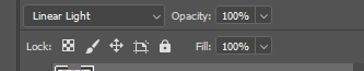
I also decided to add two layers of colour to the top right and bottom left corners, which added more colour to the composition, especially when I set these two to linear light.

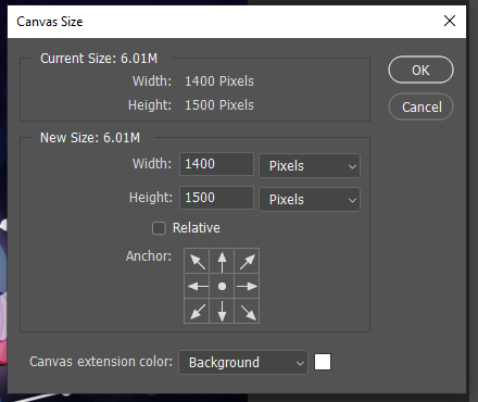


I changed the size of the canvas to only fit the two characters, as I'd been working with a larger canvas.


Here's how the images look so far. I think the three different versions of the image are all interesting.

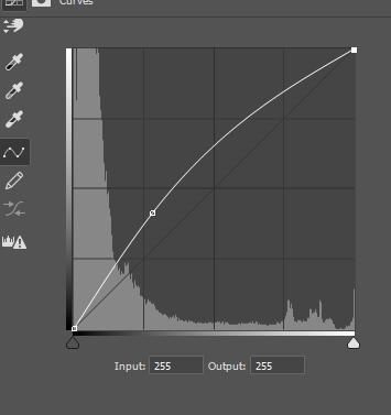


I added a curves layer to adjust the colours. I wanted more purples and warm colours in the image to compliment the red and lilac of the characters.


Here's the version of the images with the curves layer added.

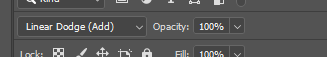
This is the final image that I created. I decided instead to go with linear doge (add) layer style to the outline instead. I first drew this on Wednesday the 21st of October when I was in college. It hadn't originally been my plan to start doing some more work for my portfolio that day, but due to some programmes not working, I decided to spend my day getting used to Photoshop again, as I hadn't used it in a while.

I also decided to use the same image to create the other version of the picture that I'd drawn as well. I used the same colours and layer settings, and used the polygon select tool to separate parts of the purple character outwards. I then applied a mask on top of her and gently erased her legs and feet out of the image.
I'm very happy with how this image turned out, and how I managed to take a drawing from last year and give it a style I'm currently interested in. I also like the comparison between the two images, which tells more of the story I concocted in my head when I first drew these characters.
This one was done probably a month after the original, and I originally hadn't even considered it until I found myself with a bit of free time at college. I'm honestly happy I did, since it helped me get more used to using masks in Photoshop, which is something I've been trying to do more often.
I'm still unsure if I'll continue in this trend of creating the constellations as characters for another year, but this was a fun project I set for myself, and never felt too big to handle.


Comments