UI/UX - Making a Website Part 2
- May 9, 2021
- 2 min read
With more designs complete, I can finally set back to work on creating my website.


I started off by pasting in sections of my Game Design Document into their correct places on their pages.


A few pages will have text that links to other pages, which prompted me to hyperlink and the relevant sections to the correct pages.

This also brought up that issue of having all text as the same size depending on its purpose. I went with size 40 for page headings, 35 for sections/subheadings and 17 of paragraphs. This was easy for me to keep track of as I went down the pages.


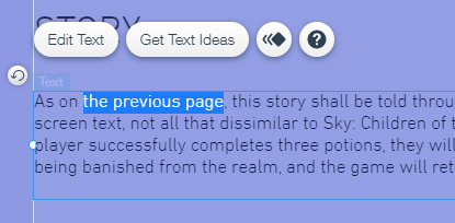


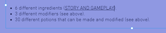
The Story and Gameplay page is where things got more complicated. There are many headings and paragraphs on this page, some of which are written with the context of being in a word document/PDF. I had to change some parts of what was written to make sure everything made sense, complete with more hyperlinks.
This was the case with the first sentence, which I had to change to 'As on the previous page,' and then link to said page.
Since this page is so large, I had to extend to the container box down in order to give me room to work with.


In the design for this page, I had already laid out all the images. It was just a matter of bringing them into Wix and positioning them correctly. I then added in more text boxes and pasted in the sections. I had to add a small bit of text so that someone viewing the page wouldn't be confused as to what some of the closer together charts are representing.
I also had to split the bottom text box up because it wouldn't fit next to the image.


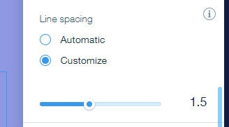
Next I moved onto the smallest page in the document, which looked even smaller on my screen than what I was expecting. I didn't want to up the font size, as I knew that would look messy, so instead I upped the line spacing so that the page didn't feel as small.


The next page I created was the First Time Experience page, which contains the playboards of the game. I put these into a slideshow that the viewer can interact with.


I then doubled back to User Experience, which is one of the sections of the Game Design Document that isn't complete. I made sure to leave myself a reminder to add in the rest of the text once it's been written.


I then went into the mobile editor and organised all the pages like I had designed them previously. I also changed some of the font sizes, as the subheadings were larger than the page titles. The page headings became 38 pixels and the subheadings became 27, which looks far better.


From there, it was just a case of rearranging some of the images and centering them. Because of the slideshow the mobile version of the First Time Experience page had gained a lot of room. I had to short the page before I could reposition the slideshow.
This concludes my progress on my website so far. The next things I need to so is complete my Game Design Document. I might also look into adding anchors to pages, as some of the pages are quite long and may be hard to navigate.


Comments