UI/UX - Wireframing a Website Part 1
- May 3, 2021
- 2 min read
Updated: May 6, 2021
The first thing to do before jumping into creating a website is to design its layout and pages. This is a good way of getting to know how a website may be laid out, and how to design the pages and sections to be as user-friendly and easy to use as possible.

I used Draw.io, a website good for making graphs and diagrams, to create all the wireframes I designed. I also made sure I labelled each of the new features I added as the pages went down.

To make things easier, I broke up the document into segments. Here is the first segment I created, where I experimented with different layouts. I even considered having the subsections of the Game Design Document being their own pages. But I decided that this was needlessly convoluted, and instead opted to have all the information from a section on one page.


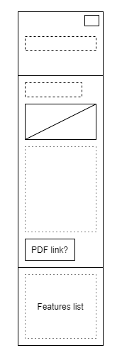
Now I moved onto the actual wireframe design of the pages. I started with the home and about pages, which are small and concise. They won't have a lot of text on them aside from what's relevent and necessary, so I designed them to be small.
If I do need to size these pages up, then thankfully, Wix is what I'll be working with, and pages can easily be extended with tools in the Wix editor.
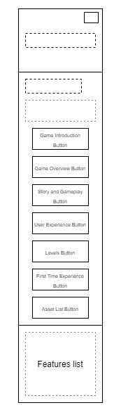
Another challenge for me was to design the GDD Navigation page. I decided not to have a drop-down menu with all of the pages, and instead have one page as a menu for all of the pages. So then came the question of how I would layout the buttons for each page, whilst also making interesting and readable. So I came up with a brick-laid style of buttons, which I liked the look of. This design makes it easier to see the full scope of the GDD without reading through it.
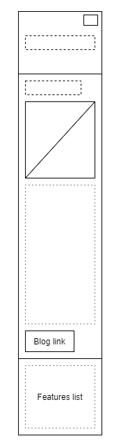
The next two pages use the same format, which I decided would be used for all the GDD pages. This will unify all of the sections of the document, as well as make everything look neat.

This is possibly the longest page that will be on the website, so I designed it. This page also features far more images than the others, so I wanted to plan out how I could position these with the text from the document.
At the bottom of the page, I added in three buttons. I decided that all the GDD pages would have this so that the website was easy to navigate. The three buttons will either take the visitor to the previous or next section, or back to the GDD navigation page. The previous and next buttons will be labelled with what section they link to.


Lastly, if someone goes to the website on mobile, I have to make sure the pages look nice and are organised well. If not, then people looking at the website on mobile may be detered from returning to the website all together. Some butons will have to be moved around in order to make the page readable in this format.
Using this wireframe, I can go ahead and start putting together a rough version of the website on Wix. That's my next task, which I jsut made much easier with all of these diagrams.


Comments