UX/UI - Making a Website Part 3
- May 11, 2021
- 2 min read
Continuing on with creating my website, I needed to make some corrections to some of the text. Over the weekend, I'd gone back into my Game Design Document and corrected some of the mistakes and added in various things.


Because of this, I had to go back through all of the pages one by one to correct any of the text that I'd changed in the latest iteration of my document.

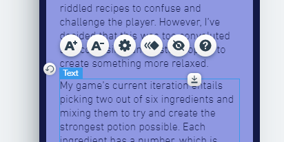
This sometimes having to replace entire text boxes worth of text.


The Story and Gameplay page had a few extra paragraphs added on, so I had to go back and rearrange both the text boxes. On the mobile version, I also had to move these two boxes apart so that they wouldn't run into each other.


Then I moved onto the User Experience page, which I had to change the main menu picture as well because I'd added in a button. This also meant I had to add in some text explaining what the new button is and how it works.
I then went to the Asset List page and pasted in the bullet point list, as well as changed the font sizes for the heading and sub heading.


I then brought in screengrab versions of asset chart, which I did in two images because it spans two pages. I then sized and positioned them together in the centre of the page, and adjusted everything else to ensure they fit nicely.
Once I was happy with how it was looking, I went into the mobile version to straighten up the images and make it tidier. I decided to change the name of the subheading for the chart to Spreadsheet to make it clearer as to what the images below are.
This concludes my work on the website so far. The next steps are to add any images I haven't already, and complete the Home and About pages.


Comments