UX/UI - Making a Website part 4
- May 14, 2021
- 3 min read
One thing I hadn't touched on yet was the footer. The footer will have a list of the pages of the website, which will be hyperlinked to the correct pages.
I quickly wrote up a little bit for the home page, but I will add more later. I then moved down into the footer and added the smallest paragraph I could find to create a features list.

I started by writing out a list of the different pages of the Game Design Document, using an indent to distinguish the pages from the navigation page.
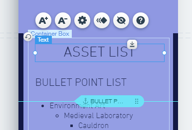
I decided to try something out. Since some of the pages of the document are quite long, I decided that adding in anchors to the pages would be a good idea. I'd never used anchors in wix before, so this was a lot of fun.
I added in two anchors to the sections of the Game Introduction page, naming them the same things as the sections they're anchoring. I snapped them in line with the tops of the subheadings, which will allow me to make everything uniform.
I then easily found out that I could create links to the anchors of a page in the same way that I can link other pages together in Wix. I then went through all the pages and created anchors for all of their sections if there was more than one.
Although some of these pages are so small that no scrolling is required, I wanted to have all the pages be uniform. It wouldn't look right if some pages were anchored and others weren't. There's also the point of the mobile version of the website being narrower and longer than what would be on a computer, so having these anchors would be beneficial to someone viewing the website on mobile.
As I was going through all the pages, I was also editing the footer with every new page. I added in another indentation for the subheadings of a page, which makes it far easier to understand the components of the features list.
The User Experience page was an interesting one, as there are four sections. I decided to keep to the pattern and made gave all of them anchor links that I attached to their counterparts in the features list in the footer.
Once I'd finished going through all the pages, I changed the formatting of the features list, making the page titles and sections gradually smaller in size, as well as embossing the Game Design Document link. I also added in two more text boxes for the Home and About Project pages, which also have links on them. I decided that I'd include those in the footer to bring awareness to their existence, as they're only buttons on their respective pages.
I also tried to make the footer more appealing by adding in the website's title to fill up the space. This may change in future, but for now it fills up the empty space.
With that done, I moved into the mobile editor to make sure everything was matching up there. Unfortunately it wasn't, and I had to go through all the pages and move the anchors back in to the same positions they were in the section headings as they are in the computer version of the website.
I then went to the footer, which had organised itself in a strange order. I reordered it and then had a quick look around the pages to make sure my editing hadn't messed anything up. Unfortunately, adding the text I had to the home page had created a lot of empty space where the rest of the text used to be, so I had to shorten the page back down to size.
Other parts had also been affected, such as the about project page, which I fixed in a similar way.
Going back to the mobile pages of the Game Design Document, I tested out the anchor and found that it put the section heading that it was attached to in the middle of the screen. I decided to move the anchors down to to the tops of the text boxes to see if that helped.
However, it didn't really do much, but I decided to be consistent with this and moved everything down to top of the paragraph text boxes.
This concludes my work for the day. My next task is to implement some images into the home and about pages, as well as get some people to test out my website to see where I need to improve and what I can change.


Comments