UX/UI - Making a Website Part 5
- May 16, 2021
- 2 min read
There is still a lot missing from my Game Design Document and website, so I decided to work on them simultaneously.


The first thing I did was create an image to use on the Home page of the wedsite, which was a simple drawing I took into Photoshop to add some lighting and shadows.

I then added it to the home page of the website.


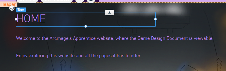
I then changed the colour of the text to a lighter pink so that it was visible.


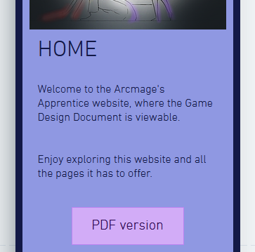
I had to change around the layout of the text box and PDF button a bit because of the size of the image. I went into the mobile editor and changed the colour of the text back to how it was originally.


I then put the same image in the Story section of the Story and Gameplay page, as I wanted to break up the blocks of text with something more interesting. This image also directly relates to the text, which is something I changed when I did this.
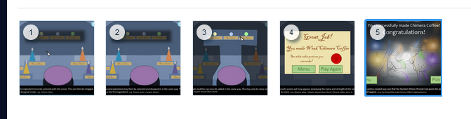


I then went onto the First Time Experience page and added in an extra step in the gallery I had added to the page. This has also been added to my document.


I also added in a new section in the User Experience page, which features the Special Victory Screen, which is something I decided to add to my document as well. I made sure to add an anchor to the page for the section.
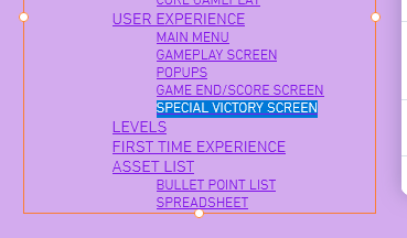


I made sure to add the section to the features list and to link the anchor to it, as well as making sure everything was alright on the mobile version of the website.


I then created two more images to add to my document, so these needed to be added to the website as well.


I started with the character and tower image, which I placed in the Theme/Setting/Genre section.


I then added in the next picture, which is of some concept art I did whilst creating the first iteration of the game. This will need written details about the concepts, so some text will be replaced on this page.
Before I do any of this, I need some people to come and test my website, so this is the next thing that will happen.


Comments