UX/UI - Making a Website Part 7
- May 19, 2021
- 2 min read
Picking up where I left off, I decided to change some of the text in the website to go along with a new version of my Game Design Document. I decided to do this before messing around with the colour themes of the website.


I first went through and added some text about the target audience of the game, which I'd forgotten to add.


I then opened the site theme menu and mess around with the hues that I could have on my website instead of the ones I'd been working with so far.


Before I commited to anything, I added a new section into my document, which meant I had to add it to the website as well. This new section is about the target audience of the game, which I decided deserved its own section in the document. I added an anchor to the section and linked it to the features list in the footer.
I made sure everything was lined up correctly in the mobile version before moving onto the next task.


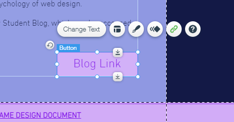
I next task was making sure everything was up to date in my document, as I had to go back and edit what I'd added in earlier in the post because of the new section I'd added to the GDD. I also explained the blog link button on the About page.


Once I was done with that, I went back to experimenting with colours. I liked these colours, although I wasn't sure I wanted to commit to them without a second opinion, so I memorised the HEX codes of the two colours I liked the look of.


I then decided there were a few things I needed to edit. I decided that I wanted the title strip of the website to match the colour of the selected button on the menu bar. This led to me changing all the settings of the buttons on the website to go this colour when hovered over. I'm not entirely sure I like this, and I may change the buttons to match how the menu acts when hovered over instead of clicked.


I then went back into the mobile editor and edited the menu strip in there. I changed the colour and font size of the text, and also the exit button for the menu, which was originally black and didn't look right. I also made the selected colour of the text white, which matches the computer version of the website.


Some of the buttons in the mobile version were positioned and sized incorrectly, so I went through all the pages and corrected them to fit in with everything else.


Finally, I tried to change the colour of the hime page to match the image, as the bottom of the page sticks out. Unfortunately, since this affects the mobile version of the website as well, I couldn't implement this.
My next task is to experiment with colours more and get a few more opinions on how to proceed from here.


Comments