UX/UI - Making a Website Part 8
- May 22, 2021
- 5 min read
Updated: May 25, 2021
Continuing on with creating the website of my Game Design Document, I still had a lot I needed to complete.


I started by going through the website and changing anything that I had edited in my Game Design Document, which was coming closer to completion.


I decided to add a new section to the Document, which meant I also had to add this to the website. The section I added was about the previous iteration of my game, which I also gave a link in the features list in the footer.
This was done whilst I was going through my website to correct it.


Once I'd finished going through the website, I decided to experiment more with the theme colours. I first made sure to remember the hezes of the two base colours, in case I decide they are the best colours for the website.
I decided to go with duller, more muted versions of the colours I was using before, which I found to be the best solution. I also tried out a lot of different shades of blue, which I felt didn't match the mystical theme of my Game Design Document.


Once I'd settled on the colours, I went back through the website once more and aldded yet more changes to the text boxes.


This had me going through just about all the pages to make some of my discussions and ideas clearer to a viewer who'd be reading this for the first time.


I then, after long last, completed my Game Design Document and uploaded the PDF version to the button on the home page of the website. I also decided that the blue I'd chosen for the background of the website was too saturated, so I dulled it down a touch so that it wasn't so bright.
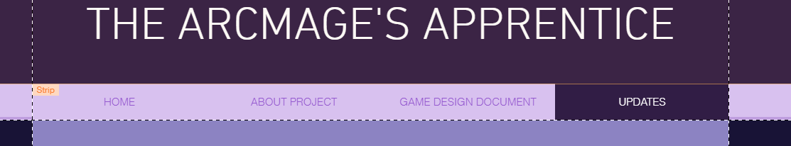


It was at this point that I decided to clarify a few things with my tutor about this unit, and discovered that a few things I had done were incorrect, and that I needed to add in one final page to complete my website. This page was the Updates page, which would hypothetically allow potential publishers and producers to get in touch with me and ask questions about the game.
This is something I hadn't thought of originally, and this part of the brief had gone over my head. I had still designed this website to be viewed by hypothetical game producers, but I hadn't given any thought to how these producers would get in touch, as part of the unit 'scenario' was that the game producers were part of a new branch formed by a Nescot company, called Third Floor Games.
This meant that some part of my website were too relaxed in how formal they were. The way my tutor best explained it is that I have to write as if I am two peoplel; the author of the Game Design Document (myself), and a third-person off to the side. This makes a website more official and formal, which is something I hadn't considered until I was explained this.
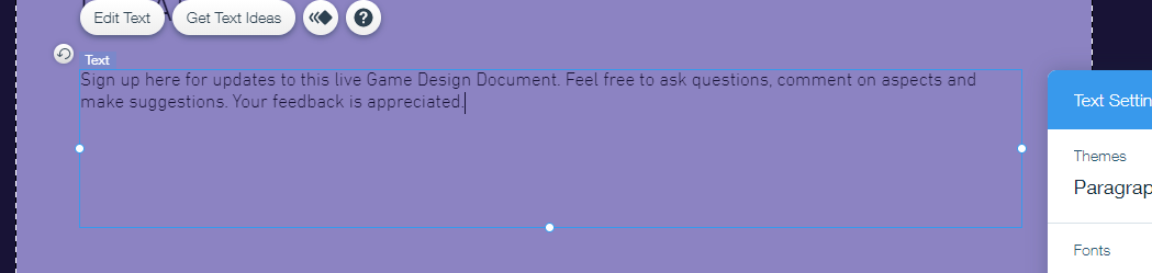
With this now in mind, I set about adding a contact-us form to the Updates page, and labelling it Client Participation Submission. This wouls be where potential clients could ask questions, give criticism and point out any errors on the website. Since this website is a live Game Design Document, all criticism could be taken into account and things on the website could be changed accordingly.


I started editing the contact form to match the rest of the website and the theme colours and fonts.

Once I'd done that, I went back over to the About Project page to make a few corrections. Since this page is very informal, I will come back to change this more later in this post.


I then went back down to the footer and moved everything around so that I could add in a another bar with a link to the Updates page. This also meant I had to go into the mobile editor to make sure everything looked okay on there. I decided to adjust how the website title was positioned, but other than that, everything was fine.


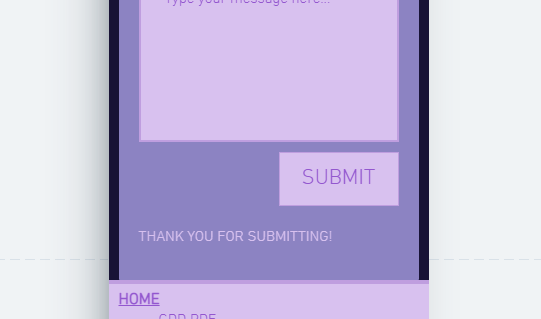
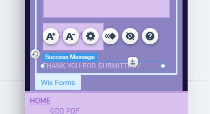
Still on the mobile editor, I decided to check out how the Updates page looked. The contact form was a bit jumbled, so I adjusted it to the centre of the page and then sized down some fo the boxes to look more appealing to the eye. I also moved around the 'thank you' popup and the submit button, which had switch places.


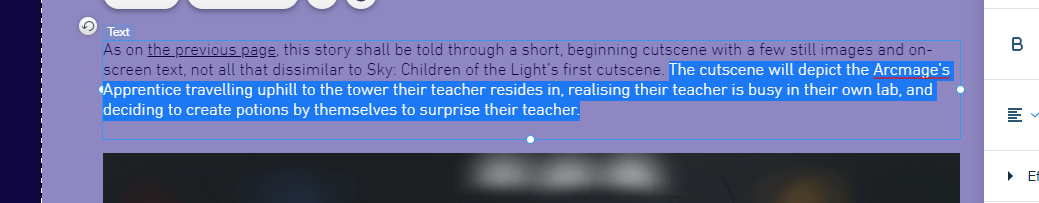
Another bit of feedback I'd gotten from my tutor was that the spelling I'd chosen for Arcmage was wrong. I had originally gone with this spelling because it looked more plausible, and Microsoft word would flash up saying it was spelled incorrectly no matter how spelled it, so I went with one the one I thought was correct.
However, I quickly realised that this wasn't the right way to spell the word, and with two people now saying the word didn't look right, I decided to go through the website and change it everywhere I found the word to be spelled 'Archmage' instead of 'Arcmage'. This also meant I had to recreate the PDF, but this wasn't a big issue, as word has a tool to find and replace words with only a few clicks.


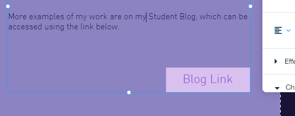
I then returned to the About Project page, and renamed it About Website. I also changed to text to be more formal, and got rid of the blog link, as this project is suppoed to be separate from everything else at college.

I also spaced out the fill-in sections of the contact form, much like I had in the mobile version, as I felt that it looked better on the screen.


I then added a text box and heading to the page, which I filled out accordingly, making sure to stay as formal and straight forward as possible.


I then made sure the mobile version of the page was alright. I ended up having to move the button and 'thank you' popup around again, as they had reverted to how they were because of the editing I'd done on the mobile version.
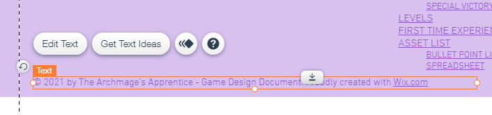
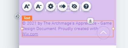
Finally, I went down into the footer and changed the copyright text to match title of the website, which I then published right after. Here is the link to the website:


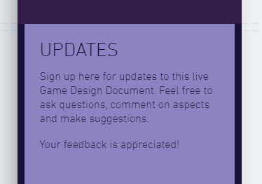
After publishing, I decided to make one final change to the website, and that was to separate some of the text on the Updates page, which I felt made it bit more readable.
That concludes my progress on the website, which still requires some more testing and feedback so that I can make any final changes to it if needed. This is what I plan to do next. After I've gotten any final feedback, and made changes, that will be the end of this unit.


Comments