UX/UI - Making a Website Part 9
- May 25, 2021
- 2 min read
Going along with the second set of feedback I received, I started making corrections and experimenting with Wix to make the website easier to use.


I started by making corrections to footer, which was still labelled incorrectly. I changed it to say 'About Website' instead of 'About Project', and got rid of the student blog link that had accidently been left there.


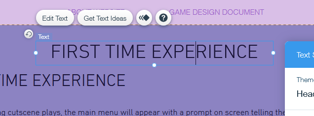
I also went into the mobile editor and adjusted the spacing between the text boxes to make things more readable. The final error I corrected was the title of the First Time Experience page, which had an error in it which hadn't shown up due to the capitalised font I'd used for the headings and subheadings.
I went into the buttons menu to see if I could fix the sliding problem, but unfortunately this doesn't seem to be something I can change. This seems to be built into Wix. I also looked in the page transitions menu and couldn't find anything to toggle this. So, unfortunately, I couldn't do anything about this.


I was reluctant to add a contents list to the longer pages, as this would make the shorter pages look odd for not having this. I tried out something with a box above, but I couldn't decide whether or not I liked how it looked. To help it stand out, I made it match the menu bar and the footer, where the features list is. This will help visitor make the link between the two, as they both serve a similar function (showing a contents list to help the viewer navigate the website).
One of the reasons I was reluctant to include this was because of the scrolling that happens because of the buttons at the bottom of the page. Due to the scrolling, the viewer will already have an idea of what comes next on a page whilst reading through it.
Another reason I'm reluctant to add in a contents list is because someone who reviewed my website in the latest feedback post, which warned me that the pages may look crowded or messy with a contents list at the top of them, or even become confusing to a viewer.

I tried adding a line to it to see if that helped remove the confusion between it and the rest of the page, but it still doesn't look right. A way to fix this again would be to put in lines at every new section, but this would be time-consuming and needless if the contents list isn't used.


I then tried centring the box and stretching it out to try and fill some of the empty space, to see if that would help with the presentation of the website. However, I'm still undecided as to whether I want this on the website. I will go to the same people who've tested out the website before and ask them their opinions on this, which will finalise my decision.
This concludes the changes to my website for now. The next thing I need to do is get more information on what to do about the contents page, and find out whether this is something I should add to the pages.


Comments