UX/UI - Wireframing a Website Part 2
- May 9, 2021
- 1 min read
Continuing on with wireframing and designing my website, I still had a few things to do before creating some of the pages. I've already designed the computer screen version of the website, but the mobile version is something I haven't looked at for majority of the pages on the website.


First on the agenda was to design the rest of the GDD pages. This includes the User Experience, Levels, and First Time Experience pages.


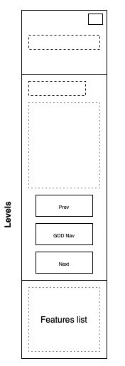

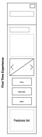
Here are the mobile designs for the GDD pages. I used the same method as I had for the previous mobile page designs, and simply took everything featured on the the web page designs and stretched them out and sized them down to fit onto a phone screen. There are a few features that are different from the computer designs, such as the arrangement of the buttons at the bottom of each page.
Another change will be the slideshow of images on the First Time Experience page, as this won't be as big on a mobile screen, and had to be sized down to fit. The only page left to design is the asset list, but to do this, I need to complete my Game Design Document, which still has a few pieces missing.


Comments