Illustrator - Creating a Car part 1
- jesskesson
- May 14, 2020
- 5 min read
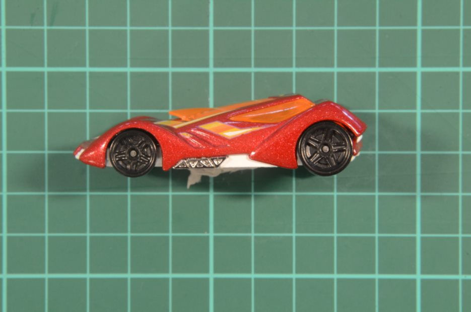
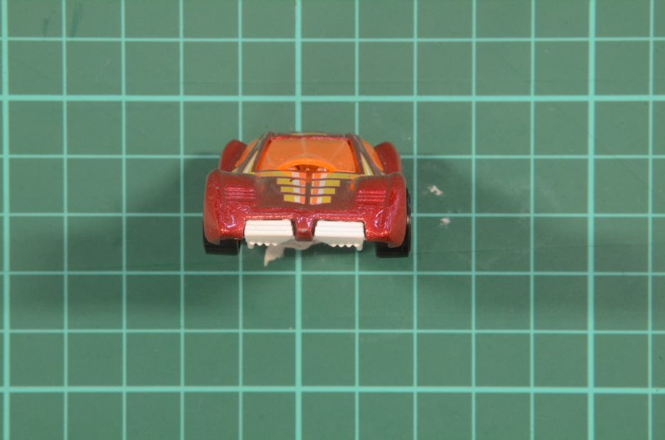
As we didn't have a 3D project this year, we were each given a car to model. Before we could start modelling, we took pictures of the cars from various angles to create drawings of them in Adobe Illustrator.

The first angle I worked with in Illustrator was the side view. I brought it into Illustrator and made sure it was the right size to be worked on. I got a complicated car to create, as I have no other reference for it other than the images I've got of it.
I started by using the pen tool to make a rough outline around the entire car. I did this without going into too much detail, as I could alter and change it later. Once I had a simple outline around the whole thing, I started smoothing down and editing the edges. Since my car has a lot of curves and not a lot of straight edges, this took quite a while to tweak.
Before I went into the tiny details, created two circles and placed them above the wheels. I then cut out the circles to create the space for the wheels, which also helped me in getting the rest of the shapes on the car correct. I added in some circles to simulate the wheels as well.
With a simple outline done, I moved onto more of the details. I added the windows, which was on of the most challenging parts of this project. As the front window sticks up, it was hard for me to get the shape of it right while also maintaining the shape of the bumper. I also added in some lines to convey the shape of where the car stands up around the wheels, which is a defining and prominent feature.
I next things I added were the divots in the front and the outline of the paint. I also added the engines underneath, and marked out where the separate components end. I made sure that I was always working on different layers, which I labeled accordingly.
Next, I fixed up the front and back of the car, adding in the details like the undercarriage poking out at the front and the back. I also added more detail to the engines on the side. I went on to tackle the wheels, which took quite a long time. I started by drawing in the divots in the wheels, as triangles, then pulling out one side to look rounder.
I did this on both wheels before adding more triangles in between each of them, and then added two circles to the wheels, and one bordering the outside. I did this with the pen tool, as I wasn't familiar enough with Illustrator to attempt to use any of the other tools. Although I know they would've made the car more accurate, I still think I did a good job.
I also added in the different parts of paint, as their a various different colours that go into it. Unfortunately, I realised what I'd been doing wrong at this point. It was no issue that all the components were on different levels, but some parts weren't fully connected, and thus I wouldn't be able to fill them in with colour until I fixed the problem.

I went through all the layers and linked up any lines that weren't matching, and filled in the colour. This took a while, as I had to go through each layer one at a time to fix everything up.
I gave the main body of the car a bright red, and the parts of it that are further back I gave a darker shade. I gave the windows a yellow to orange gradient, which I think shows the shading of the windows well. The wheels were a bit more complicated to colour, as I wanted to show the difference in depth. I gave the wheels different shades of greys and blacks to try and convey this.
Overall, the side view of the car is finished, but it took far longer than I expected. I think this is because I had never used Illustrator before doing this, and it took some time for me to get used to the different tools and to feel comfortable to try out new things.

The next view I did was the front view, which didn't take me as much time as the side view. This is because I had an idea on how to make things easier for myself.
Now that I was more comfortable in Illustrator, I decided to try a few things out. I created the main outline of the car on one side, copied the layer, flipped it, then attached them together. I think this made the work so much easier, as I essentially only ended up having to make half a car. This also made it more accurate.
Since the photo I took had the car at a slight angle, I used rectangles to create the wheels, and brought in the corners to make them softer. Using the same method I had been, I created the front and side windows, which I had to move into place.
I moved onto to create the outlines of the paint, which I had problems centring, as there was a lot of other object on-screen that it would 'click' in line with. I eventually got it close enough to where it needed to be, and decided to move onto the back wheels. As these stick up further than the front wheels, I had to make sure the shape of them was smooth along the top.
Next, I added the divots, and then the details on the window and bumper. I also added the undercarriage where it peeks out at the front.

This is how the front is looking so far, as I still need to finish it. I think the bumper definitely need some work, as it looks a bit jagged. I made sure to use the same colours as the first image, as it was the easiest way for me to check that everything looked okay.
I still need to finish the undercarriage, as the only parts I have made of it are at the front, and they need the rest of them behind it. Another thing about the front view is that it isn't good to work from for 3D modelling, as it's clearly being affected by perspective, and is also leaning forward slightly in the picture. This means that I'll have to edit this before I can use it to create a 3D model of the car.
Unfortunately, due to lockdown I probably won't be able to start on the 3D part of this project, but I'm glad I spent as much time as I did in Illustrator, as it's something I'm more likely to use in future. I feel a lot more confident in using it now, but I know I still have a lot to learn about it. It took me ages to work out some of the problems I ran into, but luckily now I have a better understanding of how things work.
If I were to take this project into Autodesk Maya to create a 3D car, I would use the two images I have as image planes and reference for creating the car. As for texturing, which was the final part of the project, I would give the windows and metallic engines of the car a pong for the windows, which would give them a shine, blinn for the main body of the car, and the wheels a lambert, as the wheels shouldn't be shiny like the rest of the car.
As I'm not good at texturing, I would also make sure to make each of the separate paint their own components so that I could paint them each with the right colours. Although these could be painted on in Substance Painter, I have no experience doing that kind of texturing, so I would feel more comfortable doing it another way.
Overall, I think I've learned a lot from this project, despite the fact that I may not get to finish it.


Comments