ISIW - After Effects
- jesskesson
- Mar 10, 2020
- 5 min read

Updated: May 26, 2020
IThe next step in the project is to take the individual layers into Adobe After Effects. While taking them in, I had to make sure the layers stayed individual, as I would be needing to move them around to create a composition.
My plan going into After Effects was to have everything move slowly to create the illusion of movement. Before I went into After Effects, I made sure all the different parts of the image were seperate and could be moved seperately. To do this, I needed to individually rub out the shadows from everything else for all of the items. I ran into a few problems, as all the shading was on two layers. I managed to make it work, however, and then just combined all the different groups into one layer, so that it would be easier to move things around.


The first thing I did was try to move the character. I struggled with this, as keyframing was something I'd never experimented with in After Effects. I started with the plan to use pins to move around the character's cloak, but I knew that it would never look natural or flow well if i did. Instead, I decided to focus on simple movements, then add the details later.
The first thing I discovered was that animating the character would also mean they would be diminishing in size. My plan was for the character to be walking towards the castle at the left. When I moved them over, it didn't look right because I hadn't scaled the character down. This led to another problem, as moving the pivot point on the scale (which is kept in the middle of the composition) would move the character. This meant that the movement didn't look right, and the only way to fix it was to go back and redo everything.
This time, I scaled it first without moving the pivot point, but made sure to keyframe it correctly. Then, I moved the character afterwards, which cancelled out the odd movement of the scale.
I used the same method on all the buildings. Because they were bigger, I was able to just scale them, as they were in the centre of the shot, where the pivot point was. This made my job a lot easier, and I could literally animate parts of the scene in less than thirty seconds. I made sure all the movement in the buildings made sense, as it didn't seem right to have one building moving one way, and another doing the opposite. The only exception to this was the well in the centre of the scene, as it seemed to balance things out, because the rightside of the scene is more crowded than the left.


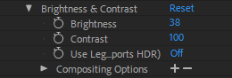
The next thing I tried to add was a lens flare, as the sun is setting over the mountains, I thought having one would be a good idea. I ended up deciding against it, however, because the lens flare didn't match the rest of the style. Instead, I decided to duplicate the sky layer, and erased half of it. I brightened the right side within After Effects, which really brought it to life. The shadows in the sky had been too dark, but putting a gradient on them had fixed the problem.


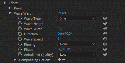
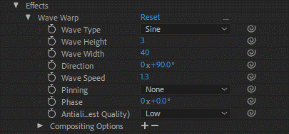
Now that the main animation was out of the way, I went on to the finer details. Trying to animate the flags wasn't easy, as I had no idea how to only have an animation effect specific points of an object. So I replicated what I did with the sky, and erased the buildings away from the flags. I made sure to have the flags both on different layers, as I wanted to be able to change things easily.
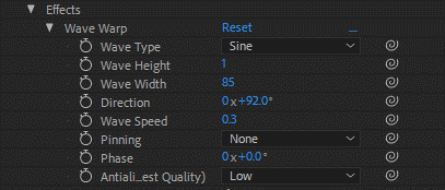
Initially, I gave both the flags the same wave warp animation. But then I noticed how odd it looked for them to be moving at the same pace. I offset one of them to have a speed of 1.3 instead of 1.4. This is a subtle change, but it offsets the flags enough to be convincing.


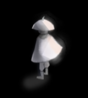
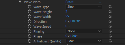
With this newfound method, I decided to tackle the character's cloak again. I went in a duplicated the character, then erased everything but the right and bit of the centre of the cloak. I then added a wave warp. At first it looked terrible, and it took a lot of trial and error to make it look right. I ended up having to erase more of the left side of the cloak and the underneath part of the original layer to make sure everything ran smoothly.
Overall, I think the animation works well, but I woudl've played around with the settings more to see if I could find something else.


Another detail I added was the clouds. With everything else in the composition moving, the sky seemed too stationary. I decided to create the clouds as seperate layers, and give them a small ripple and a bit of movement. I made sure it was slow, so that it couldn't really be picked up, but since it is happening, it gives some much needed movement back to the top of the composition. The two mountain layers are also moving, but I had to be careful, as I didn't want to show the underneath of sky layer.
This is the full version of the ISIW project. With that, I ran out of small details to edit. Overall, I think this part of the project has been the most sucessful. In the beginning, I was worried using an idea I'd previously used for a college project wouldn't give me much freedom, but I found that it was extremely easy to fill in the blanks, as I had already written them.
Concepting was an interesting phase, as I wasn't saw what I wanted to do with the project, or what direction it was going to take off it. I already had an artstyle thanks to my Game Design Document (which is where the idea for this project came from), but I didn't have much in the way of inspiration since I wanted it to be fantasy. I decided that I could take inspiration from historical architecture, so I started looking into various different time periods. The one I was first so focused on was the Byzantine Empire, which was just after Roman times. This form of architecture led me to look at neoclassical architecture, and even Romanesque. Although I tried my best to encorporate as much from each distinct style while also giving it a flare of fantasy, the main motif is definitely Byzantine.
The actual making of the image was a lot harder. Modelling in Maya only took two days, so I was able to mess around with what kind of composition I wanted early on. After bringing it into Photoshop, I had a hard time deciding on the design I wanted. This took up a lot of time, and I eventually just ended up going for it with simple colours. The shading is definitely something I would redo, although I think I managed to make it work by dimming the opacity. Overall, my Photoshop skills have improved during this project, and they still have a long way to go. These were my weaknesses during this project. Not having much experiment with Photoshop, and also not being able to draw environments or landscapes well. I managed to work around the landscape problem, but my practise with Photoshop has only just begun, and I see now that this is one thing I need to improve on during the remainder of this course.


Comments