ISIW - Concept and modelling
- jesskesson
- Nov 6, 2019
- 12 min read

Updated: May 26, 2020
For the past few weeks we've been given a new project. In the project, we were asked to create either a 3D environment or an image in photoshop depicting some form of fantastical world. We would then edit the image to appear to move, and then find sounds to go along with the environment.
This project is called Images and Sounds for Imagined Worlds, or ISIW for short. In this project, the first stage is conceiving an idea. I decided to make it easier for myself and go for an idea that I was familiar with. My favourite project of the previous year was the Game Design Document, where we essentially created our own game concepts. So, I decided that the image and concept I would create would be for an area from there.
Of course, I spent a while debating on which area to do (as I had briefly explained what each of them might be like in the Document). I started leaning towards a steampunk town idea, and I also thought about drawing one design I already had in my document. But I wanted to create fresh concept, so I decided to create the area I nicknamed 'Castle Town', as it would be the final peaceful area before the final boss (of course, the game doesn't really exist, but giving the town some context was helpful with the town's theme).
To see my Game Design Document, click here.

I started off by compiling some images together. I decided I wanted a cartoony style, but I wanted the image to still look beautiful. The Cartoon Network show, 'Steven Universe' (by Rebecca Sugar), had the perfect colour pallets to describe the scenes. The one thing I love about the backgrounds in that show is the artists' abilities to keep the simplicity in the art with the outlines in the images, yet also make everything engaging to look at. This is because of the vast colour pallets, made up of analogous colours (colours similar or next to each other on the colour wheel) , and complimentary colours (otherwise known as contrasting colours, which are opposite each other on the colour wheel).
In my composition, I don't want to replicate the style of 'Steven Universe' entirely, and I want my piece to look a little more realistic. I will still try to keep to an interesting colour pallet, as the game I pitched in my document was called 'Colour Clash'. I got a few different variations of off-white, as I had the idea that the actual landscape and lighting itself would bring the colour out of the picture more than the buildings in the town.
I also got some pictures from Disney's 'Gravity Falls' (by Alex Hirsch), as they depict some of the types of lighting I wanted to go for while also retaining simplicity. The colour pallets are more realistic, and more vibrant than that of 'Steven Universe', which has an overall pastel tone. I think I will go for a more pastel and dull tone in the landscape and buildings, but the sun and sky will bring more colour into the image.

These were some of the early thumbnails I drew. I already had an idea of the types of buildings I wanted, so I gave them a small amount of detailing (I still didn't have too much of an idea).
I tried to keep the buildings in each drawing similar, so that if I changed my mind it would be easy to transfer art over. I made sure to keep perspective in mind, so I tried to make the image more interesting by bringing certain buildings forward to the foreground, and sending others back.
I tried different angles of the same area, trying to find a way to convey the world, while also making it interesting. I kept in mind the rule of thirds because it's an easy way of making an image more engaging. The third and fourth images were fun to draw as well. I tried out a upward angle, as upward angles can make a character seem small, and make a building look much bigger. I thought it would be a good idea to try it out, but I'm not overly happy about the results.

The next thing I did was go straight into photoshop and tried creating some thumbnails in it. Because of my inexperience with a Wacom tablet, I'm not overly happy with the first two I created.
I decided to try out something new, and decided to put a ruined town in a valley surrounded by mountains. I tried to create the texture of grass by using multiple drushes, but the affect is very flat and doesn't give a lot of perspective.
The image also didn't give off the right feel. I want a sharp feel to my image, because I plan to have everything be quite geometric and clear.

The next digital thumbnail I did was similar to the one I drew on paper. I decided I wanted to retry the idea with a different building. I decided to use the 'castle' as I nicknamed it, as it felt more appropriate for a large building to be viewed as more terrifying.
I also put the a person (Irid, the main character from my Game Design Document) to get an idea on how big the building would be. I'm happy with the shape of the building, but I would definitely add more detail if I designed it again.

The final idea I had was to have Irid looking down into the city from the top of a tower. This idea was inspired by the concept art of Kubo and the Two Strings, which also acted as a source of ideas for me.
This image has the feel I was going for when coming up with ideas, the only issue is that it lacks detail. Of course, since this is a concept sketch, it gives me a good idea of how to detail different parts of the image without overloading it in certain places.

By this time, I had decided the style of buildings I wanted in the town. It came down to mixture of neoclassical and byzantine architecture. Both of these styles are known for their arched windows and bold skirting stones. Neoclassical architecture is more well known for the regular gabled roofs, whereas byzantine buildings can have spherical roofs (the buildings are often circular as well). With this in mind, I decided to Maya and model the town to draw over.
Perspective is not a strong suit for me, and landscape painting is something I need a lot of practise at. Because of this, I decided it would be easier and more 'on-model' to create it from scratch and then find a good angle afterwards. I planned to have everything looking sharp and correct, thus this was the easier way for me to do it and make it look good.


The first model I made was a tower, which I created by first making a cube and then bevelling it to create an octagonal prism. The town was supposed to look simple, and each town in my document was given a different shape to be based off of. For Castle Town, it was an octagon, so I decided that most of the buildings should revolve around that.
I got another cube to make the base level of the tower and leveled it with the bottom of the main tower. I got another cube and thinned it down, before cutting lines diagonally from the corners to create a centre vertex on it. I then pulled it up (only a small bit, since byzantine styles roofs can be shallow), which made it look like a roof. I also added some corner pieces that could be turned into skirting stones later.
I added a sphere for the roof and some dormers. I did them the same way I created the main body of the tower, and the duplicated and rotated it. Since my project isn't in 3D, I didn't have to worry about making sure everything was perfect. I'm only using the models as a base to get the perspective right, so I decided that all the buildings should be vague in shape so that I could change designs later if I wanted to.


The next model I made was the 'fort', which was heavily based off byzantine palaces. I copied the main body of the tower over (I wanted everything to look uniform), then duplicated it four times and made them smaller, and moved that to the 'corners' of the main body. A lot of byzantine buildings have large dome roofs over main structures like this, so I made sure one of the buildings I had conveyed it.
Next I added the same details as the first model to keep to uniform, and added one last octagonal prism with the same roof from the tower to give it an entrance.


The next one I made was the 'church', which I started out with two cubes and extended out and into each other to create the illusion of one object (it was easier and quicker from me to do it this way).
Next I added the roofs. The roof on the bell tower is both the roof from the tower and the fort, as the rooves on byzantine builds can vary and also blend into each other. The roof on the main chapel is a separate bevelled cube, which I placed on top. Byzantine roofs can be curved, but since the whole idea behind it was that it was still going to be as geometric as possible, which is why the roofs I created are bevelled for effect.
I added the dormers and corner stones again before moving onto the last building model.


This is the 'castle', which I decided should be a cuboid like the church (a neoclassical trait). I started out with a cube with divisions and then extruding the centre parts upwards and then getting rid of the divisions. This allowed me to bevel the edges to match the roof of the church.
I also added a doorway by extruding it in, which would give me a good idea of what the door can and can't look like when I draw over it. Because of the level of the door, I decided to make a quick staircase I could use by extruding and offsetting a cube outwards. I also took the roof piece from the chapel of the church, and sized them up to fit on the two side parts of the castle.
All I had to do next was add two corner stones onto the front, and two spheres for roofs on the central roof.


Now all I had to do was put the town together, but before I could do that I realised that having a tall building in the middle of a town would abstruct everything else, so I decided to make a fountain.
Keeping to the theme and concept art, I made an octagonal fountain by extruding it inwards and then adding a spherical ornament on top.

Keeping to the theme, I placed six towers in a regular formation, and then had the castle at the back to create an octagon. I created a cube and stretched in to create a simple wall between all the towers, as I planned to have one, and wanted room to change it in post or while drawing.
The next part I put in was the fountain, which I originally had in the centre of town. I moved it when I realised it would give me more space in the middle ground, and would also mean I could have a variety of path and road designs when I draw over it. I didn't want the path to just be straight, I wanted it to be interesting.
The last thing I did was add in the buildings. I duplicated them and put two churches on either side of the fountain, and did the same with the forts on one side. I decided that I didn't want to see the left-hand side in the final piece, so I decided that I didn't need to put anything else in.
The last thing I did was stretch out the ground plain, as I wasn't sure how big the town was going to be when I started constructing it.


Because my original idea was to depict as broken and abandoned town, I started deleting any geometry that would get in the way of my scene shots. After that, I went around a took various screenshots to get an idea of the type of scene I wanted to create.

I went with the second shot I took because I wanted to be able to add in a sky later on. I also went back and selected two of the buildings, as the default shaders in MAYA made it impossible to differentiate between the different buildings.
I also got rid of the wall (so that everything is more visible), and the other church. I even got rid of a few details from other buildings to give myself a bit more destruction to work with. I didn't want to get rid of too much, as it would eliminate my guidelines.

Once I'd taken the screen shot I pasted it into Photoshop and sized it to fit in the document, before moving it up and down. I decided I didn't want too much emphasis on the ground, as the sky and landscape were an integral part of my early ideas. I decided that bringing it down would help accentuate the sky better.
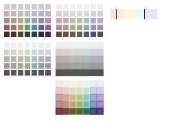


Once the lining was done, I decided it was time to start experimenting with colour pallets. I started by going back to my Game Design Document and finding the colour pallets I created then, as I thought it would be a good idea if everything in the scene matched.
I started with decreasing the saturation along with the light, but the darker the colours became, the more obvious it was that they were different colours. I created a second pallet, this one lighter, and started decreasing the saturation as I made the colours darker. I still thought the colours were too vivid, so the third pallet I made, I made sure to decrease the saturation more rapidly.
Once I'd created the last one, I decided to test out the colours against greys of the same shade. This shows me how vivid the colours are. I'm quite happy with how the colours turned out, however, I will most likely decrease the saturation further.
I also planned for a sunset, which will mostly be filled with bright colours. This meant that anything with low saturation might pass as grey anyway. To see the affects, I did the same as above, but with a high saturation on the colours. The pallets can just about pass as grey, meaning I may not change them just yet.
Another idea I had was to have all directions of the buildings have a different colour. To experiment with this, I took the outlines from Photoshop into Paint to experiment with the different colours I could use. I started with the shading of the different sections, before I went through different colours. I'm not happy with the colours I chose, as I think the colder colours should be facing forward, and the warmer colours should be round the back (where the sunset might be hitting them).

After thinking about colour, I decided it was time to finalize my design. To do this, I got together various byzantine buildings as reference. I also went for a Romanesque designs, such as Ypres Cathedral in Flanders, Belgium.

Once I'd gathered enough reference to work from, I went back into Photoshop and downed the opacity on the outlines of the building. I also drew in a person (Irid) to act as a good scale, and also because they would be in the final image. I'm not happy with the placement of the character, as it draws attention away from the castle at left of the image. In the final version, I will move the character over.
I also added in lines to signal where the path leading to the castle from the well could be, which also helped me in getting a scale for Irid.


I started drawing the first design, only to realise I didn't have much of an idea as to what I wanted the castle at the back to look like. So, I decided to create another version of what the buildings could look like to give myself more ideas and freedom.
The second design I went for, I tried to create very fantasy buildings, while also using real life buildings as reference. Saint Basil's Cathedral in Moscow, Russia was a big inspiration. I changed the dome roofs to point up in the centre. I couldn't help but be reminded of the Disney Castle in Disney Land when drawing the fort.
The last design I did I decided to go with completely historical inspiration, such as Romanesque architecture. I got rid of all the dome roofs, and either replaced them, or got rid of them entirely. I had a lot of fun imagining what the city would look like if everything was more realistically Romanesque and medieval. My favourite part of this design was thinking of ways to change the roof of the castle, as the original design wasn't at all Romanesque.

The next thing I did was get together a bunch of refence of sunsets to get an idea of how bright I might make the colours. The top three are realistic, and I wanted to make sure I had real life reference to work from. The others underneath are all either from Steven Universe, or Gravity Falls.
I don't want a completely realistic sunset, so I thought it was good for me to have very cartoony versions of a sunset of give me a boundary of how cartoony I can go.


With the help of the reference above, I created a new layer to try out shading. The first thing I did was draw in some rough mountains in the background, so that I would have a more interesting area to shade. I decided to have the sun peaking out from behind a cliff in the top right part of the scene, as it would make for an interesting sky. I also tried to shade in parts of the buildings to show which areas would be darker.


To test the shading even further, I created two more layers are drew the mountains in. This gave me an even better image for how the scene might look.


I added another layer to block out the cliffs, which really helped me see the shading. I like the idea of the sky being the brightest part of the image, because that will mean the eyes will be draw up, then down. It will also mean the image is well balanced. The only thing that will help the balance more is if I move the character over to the left og the image more.
Now that the concepting phase is complete, I can safely say I'm excited for the next step in the project.


Comments