Synoptic Project - Extras and Portfolio
- jesskesson
- May 26, 2020
- 8 min read
Although I've completed the artwork for the Synoptic Project, I still had some fun with drawing. When I was designing the second group of enemies, the Four Tenshi of the Heavens, I didn't actually think I'd put them in an image in the cutscenes.
I originally created them as a portfolio piece, which I what I started creating around the start of the Synoptic Project. I had them in mind as enemies inspired by the art I was already doing for the project, and it seemed a shame to not include them in some way.
Since the Four Tenshi of the Heavens are based on Chinese mythology, their designs are more varied than the Four Senshi of Mount Fuji. Even the most similar two, Lan Long and Lao Lu are dressed very differently.
I decided to go with the style I use when lining drawings on paper. Since I learned to draw mostly following manga and anime guides, or watching cartoons, I like to outline things are then colour this.
However, the art style of the Synoptic Project is the opposite of this, which made this project a nice change.
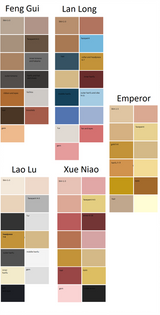
I started with lining Fang Gui the Black Tortoise. This was an easy job, as her clothing is flowy and not form fitting. I rubbed out any lines I didn't need, then moved onto the next part. I had the idea to add scales to her face and clothing to look more like a tortoise, but I didn't want to use too much black, as her character needed some colour. So I looked up black tortoises to see how their colour can vary, and found that some are brown and orange in places.
One part of lining that didn't go as well as I'd hoped was her hands. I'm terrible at drawing hands, and having to line them is just as hard for me. I can usually get away with it by drawing hands in a familiar position, or obscuring them, but this time I had them in full view. I did as best as I could, but I definitely need some more practise there.
Because none of the other characters were going have that colour combination, I gave Fang Gui some orange on her cheeks, hanfu and hat.
Her colours are mainly blacks and browns, so the orange definitely helped bring attention to her. I filled in the scales with a warm brown, so that her clothing looked more like a tortoise's shell, which is what I was aiming for.
Her hat is more Korean (which matches her plaited hair) in style than Chinese, which is something I would change. To look more like a tortoise, I should've given her a rounded hat, something that is worn in China. However, I think her hat compliments the rest her outfit, and also gives her some extra height and authority.

I'm proud of how intimidating yet calm she is. I think she would be an interesting villain to face in the game because of this. I think her clothes give away a bit about what animal she's meant to be, but it can be hard to pick on it. This is understandable, as black tortoise's aren't something someone would commonly remember.
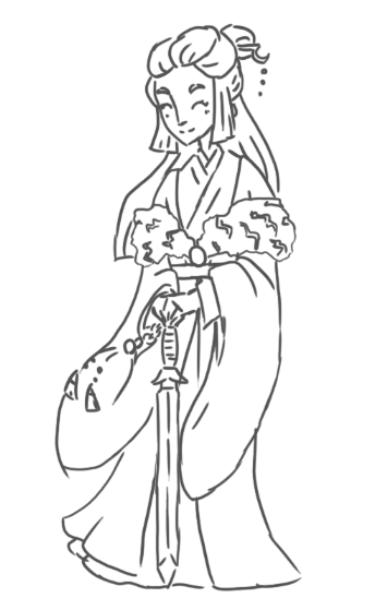
The next character I decided to create is Lan Long the Azure Dragon. Much like Fang Gui, her animal isn't obvious right away when looking at her.
I lined her in the same way as Fang Gui, but I was unsure of how to tackle the fur boa she has wrapped around her. I turned the smoothing on my brush down completely, and that created the effect I wanted.
I added scales to the bottom of her hanfu and to her face, as Chinese dragons are said to have the scales of a carp. I think these add something to her design, and definitely make her more interesting.
The main colour I gave her was blue, with a bit of red and gold, which gives her design more variety.

I like the contrast of her cheeky expression to her formal and elegant clothing. I think it explains her character perfectly. I also like the contrasting colours I gave her, as I didn't want her to be entirely blue.

When I finished the first two, I decided to have a bit of fun with photoshop. As I've been using Photoshop more frequently, I've developed a new style, which I'm far more comfortable using, as it's essentially a sketch of a character in a colour that compliments their pallet. I think it adds more personality to a character than the black lines I've been using so far.
So, I decided to do the second two characters in a different style to mix things up. I had a lot of fun with this, and the style is close enough to the original style I was using, so they don't stick out too much.
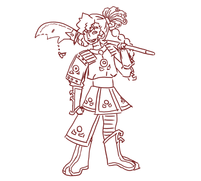
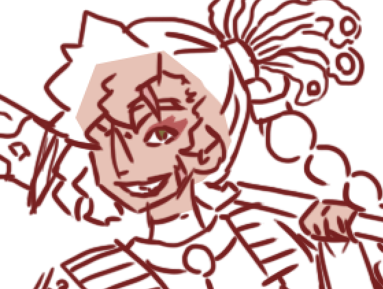
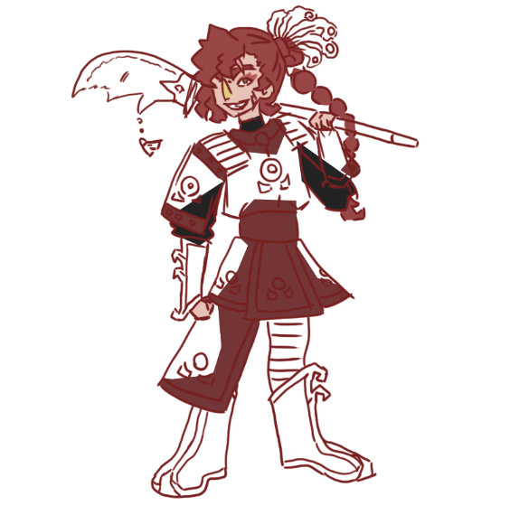
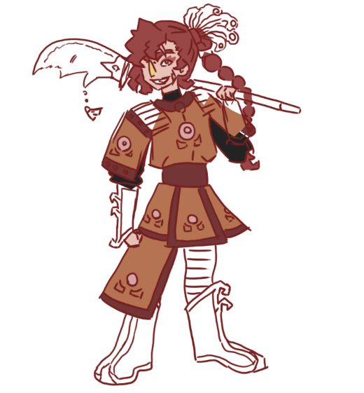
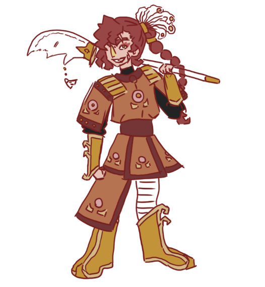
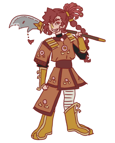
The first character I created was Xue Niao the Vermilion Bird. I gave her a maroon outline, which isn't far off from matching the colour of blood. This is appropriate for her character and her clothing, which is based off Chinese armour.
I had far more fun lining in this style than the previous one, as I felt that the pressure was off from making all the lines perfect. This is much closer to how I draw on paper, which is why I like drawing in this style so much.
The colours really go with the outline, which gives the drawing a far more 'connected' feel, as it doesn't feel like the outline and colours are completely different like they are in my black-lined drawings.
I also got the chance to draw her gauntlets and boots, which aren't visible in the other image she's in. I made them gold to warm up her pallet a bit more, as the orange I used for the majority of her clothing is a bit dull. The weapon she wields is called a guandao, which is a pole weapon. It's similar to the Japanese naginata (which I gave to another character) and the European glaive. Guandao can be very ornate, so I put some decoration on there to make it more interesting. It also has a tassel hanging on the side, which I sized down.
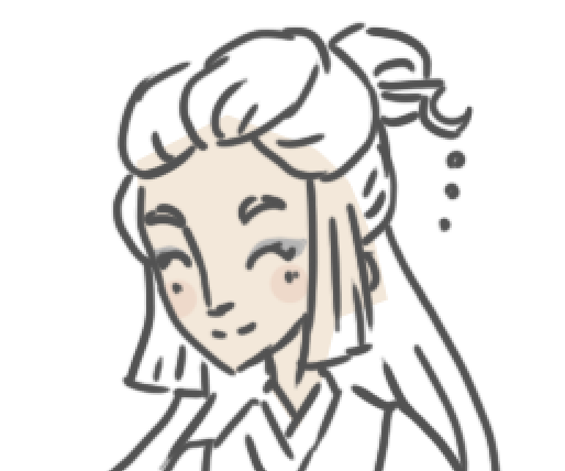
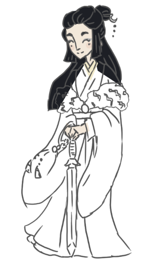
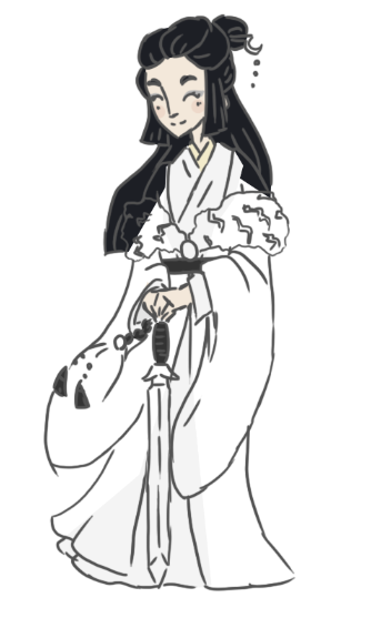
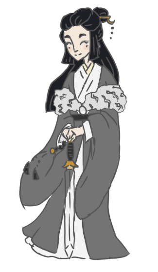
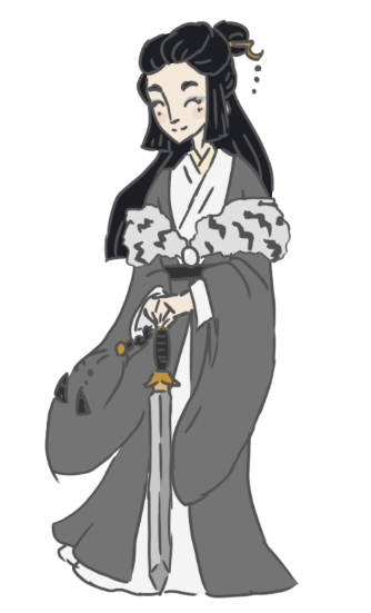
Next I created Lao Lu the White Tiger. I outlined her in a gray to keep to the style. Out of all the designs, hers is definitely the simplest. I wish I had tried to give her more features, like a pattern on her hanfu, but I feel that the simplicity of her design is true to her character.
Her weapon is called a jian, which can be decorated with tassels as well. I gave her a black tassel with a gold bead. I gave her a lot of greys in her pallet, but I feel sometimes that it's hard to associate her with the colour white. The main reason I gave her a darker hanfu to drape over her was because in my original plan for her, her hair was going to be white instead of black. However, when I changed this I forgot to take the other colours into account.
I also had to lighten a few of the colours I used for her, as the outline was too similar to them. This means her grey hanfu was originally meant to be darker. Although white isn't the majority of her pallet, I think her pallet makes her look bolder and more prominent with the rest of the group.
I love her design and how she turned out in this drawing. She's a little different looking in this version, as I originally designed her face a lot slimmer, and the upward angle which I had her leering from further distorted her. I'm not sure which version of her I prefer, but the original design looks more mature because of this.

With these two next to each other, I think the style really clicks. The different coloured outlines I gave them shows their individuality, and also compliments their colour pallets.

This is the four of them together. Although I lined them in different ways, I think they do blend together as a group. If I could redraw the first two in the same style, I would definitely try it. I would give Fang Gui an orange outline as opposed to black, and Lan Long a turquoise-green outline, as 'azure' in Chinese can mean both blue and green.
Fang Gui on the far left looks a bit odd, as she's the only one without a weapon. If I were to draw her with one now, it would be a Shaolin Spade, which were used by monks for defense.

As quarantine is still going on, I fun drawing this. I actually started drawing this before lockdown, but I realised it was perfect for the situation we're all in right now. It was also a fun break from college work.
I thought it was hilarious to imagine the enemies I designed for the game being in lockdown as well, and all getting on each other's nerves. I actually based these different behaviours off of their characters, as some of them I can easily see behaving like this. So I amplified traitsChan was already lazy, so he got lazier, Huli is being a bit of lazy as well, Yeji is playing all the video games in the house, and Yetu is fed up of being stuck with the other three.
These are some other drawings I created while the Synoptic Project was going on. The first is an image of Jing in human form, wearing the Robe of Fire Rat Fur. I had a lot of drawing it, as it was a mini project that I just did for fun. It was a good break from the project as well, but it still kept me thinking about it.
The second picture I drew for fun while reading and researching Chinese mythology. Since Chinese dragons were such a vast subject, I had a lot of fun reading up on all the different types of dragons they believed in, and what their roles were. I drew one of the Dragon Kings, Ao Guang, which I had fun with.
I put my own twist on her, as I swapped her gender. I did this partially because I know more about women's clothing in China than men's. I also did it because there aren't many depictions of female dragons in China, and dragons are more commonly associated with men (the phoenix is associated with women instead).
I like to imagine female dragons are deadly, so I made her intimidating and gave her a cold pallet. I had so much fun with this drawing that I did another one, this time of Sun Wukong, the Monkey King. I decided to make him a female as well, as I thought it would be more fun to draw a character that's very masculine in their traits as a woman.
I also decided to draw Sun Wukong because in mythology he causes problems for the Dragon King. I thought it would be funny to put these two next to each other, so I did.

I also refreshed my knowledge on Chinese folktales, which have interested me for years. Some of the best known tales are 'The Butterfly Lovers,' 'Legend of the White Snake,' 'Lady Meng Jiang,' 'The Cowherd and the Weaver Girl.'
The two that captured my interest were The Butterfly Lovers and the Legend of the White Snake, which are both love stories. The Butterfly Lovers is a lot like Romeo and Juliet, with the two dying because they couldn't be together at the end. The two lovers are then reincarnated into butterflies, which I tried to draw in the image above.
I had a lot of fun with the vivid colours I could use to represent butterflies, and settled to using pink and purple for Zhu Yingtai, the woman, and blue and green for Liang Shanbo, the man. I did, however, do their shading in each other's colours to bring them together.
The second tale is The Legend of the White Snake, which is about a snake that obtains the power to take on a human form, and falls in love with a man named Xu Xian. There are many different versions of the story, but the main premise is the White Snake's willingness to do anything to keep her lover safe.
I had fun drawing her, though I a hard time deciding on how to draw her. I always imagined Bai Suzhen (the white snake) as being naïve and curious about the world she lives in, as she's a snake living with humans. I portrayed this by making her look younger than expected, and gave her bigger eyes.
Overall, I had a lot of fun with the Asian aspects of the project, as it gave me so much inspiration for things like the background the game, the setting, the characters, and art style.

















Comments