VFX Group Project - production
- jesskesson
- Oct 3, 2019
- 5 min read
Over the last week, we've started producing our final trailer. Over the weekend, I went to my Grandma's house and filmed all eighteen shots in the front room. Before this, I played around with the camera settings on the camera I had taken out from Nescot. I noticed that the image was always grainy, no matter what I did to correct it. Despite this, I decided to go ahead and film. I figured it was better to have bad footage than none at all.
This wasn't the main problem, however, the main problem was how shaky and rushed the footage felt, which means I will have to go back up there next weekend to film again. The next time filming I will turn the white balance up higher. The lighting in the foyer and staircase is tungsten, so the tungsten setting should work. However, because of the yellow wallpaper in the house, the white balance doesn't look right. I think this was the reason it was so grainy, as the ISO was on 100, and every other setting was set lower.

What I also did, was use the footage I already shot as a plan, and used it to cook up ideas of what the UI could look like. I came up with various designs with various different fonts. My favourite is the third one, as it looks spooky and childlike. However, having arrows was suggested by the group, so that is also an idea. Having no text would make everything seem more unknown.
The UI will also change to make it appear as though it's been selected. I think a blood red colour would be good.

What I also did was plan out how the footage would pan out, where we could cut it down, where the UI should go, and other things.
I re-shot the footage, this time using a shoulder rig to make it a lot more steady. The footage came out a lot better, but unfortunately it looks even more grainy than the last takes I did. I didn't realise until I went to edit it. Because I cannot film anything again, We now have the choice between less grainy footage that is highly shaky, or smoother footage that is grainier.

This is a screenshot of what the footage came out looking like (the video file is too big to upload onto here). I'm disappointed with it, as it is shaky and grainy. One of these problems can be fixed, so I filmed again.

This is the second piece of footage (the file was also too big). It came out less clear and grainier, but smoother in movement. Because I only took three takes this time, the footage came out more consistent, as I became sloppier with the camera the first time filming. It came out darker because someone who'd used the camera before set the lighting super low, meaning I had to raise it. It came out darker, but it's more effective now.
This made me consider how everything was going to come together, and started thinking about how the footage could look dreamy and surreal near the beginning and become clearer and clearer. This is an idea that would make sure we can get the good graphics that Unreal offers, while also matching to the footage I shot. To do this, it would be better to cut all the videos together first, then add the effect and have it fade out to make it look more natural. This would also mean we could then cut the video up and add the final effects, like the UI, the logo screen and the title at the end.
On the subject of names, our project currently doesn't have one. I think it would be interesting if the title had something to do with sleep or an illusion (assuming we go with the surreal idea). My ideas were something like 'Lucid Nightmare' or 'Night Terrors'; maybe with some sort of childish saying like 'don't let the bedbugs bite,' or 'sweet dreams', something innocent that can be made terrifying.
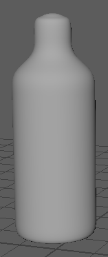
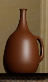
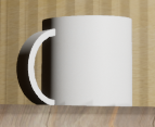
Meanwhile, the rest of the group were creating 3D models in Maya. Eduard did a great job on the crib while Archie made the shelf, the books, and the vases, while Louis made the skirting boards and the mug, and made the scene in Unreal, using textures off the internet for the models the others made. I made some reference images for them to use to make sure they got the feel right.
My favourite to draw of these was the lighting and vase designs, as it gave me a chance to try shading to create the illusion of a shiny object. If I hadn't shaded these all in, it wouldn't be clear how these objects were shaped. Another fun thing to draw was the bookshelves. They were based off the furniture in my Grandma's house where I filmed, so I had fun imagining what kind of furniture I'd find in her house.
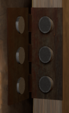
These are the textured models in the Unreal scene. Even though I did not help out with the modelling, I had a say on some of the textures that were used.

This is the Risk Assessment chart I made for the green screen shot. I made this one after the other two as I didn't have much of an idea as to how we would be filming the screen.
Another thing we did earlier in the week was go into the greenscreen studio and filmed with the baby doll. It was a lot of fun trying to work out how we were going to film it. We ended up having two tables pushed together with a small gap in between. We set up the camera and decided to film multiple takes in the same reel.
We decided to move the baby up with a stick. I sat under the table and pushed it up through the gap. There were a lot of times that the head would twist sideways, as I couldn't see what I was doing from underneath the tables. Archie had to come over a few times to straighten it before takes. The last one we did came out the best, so we decided to cut down the video with only the last take.
After that, the first week was over. The next week, we finished all the filming we needed for post week. We went to Epsom and walked to Epsom Common. Since I'm highly familiar with this area, I had to act as a guard to the group. It rained a few times, so I wasn't sure we'd be able to film. However, when we got to the Common, the sky cleared up. At first, I nervous, as it's easier to manipulate a day image into night without shadows, but the sun would come in and out, meaning we had enough time to shot a few pans and take a few pictures before we headed back.
These are the images that we took for the pan in. Because all the video files are so big, I cannot put any of them on my blog. If I can do anything about this in the future, then this will be fixed.


Comments