Synoptic Project - Cutscene images part 1
- jesskesson
- Apr 20, 2020
- 3 min read

In the Synoptic Project, I planned for two cutscenes to be created. These would be made with Photoshop and After Effects. I've already created the storyboards for these cutscenes in another post:

As I originally drew all the images on paper, the first thing I did was scan in the drawing to use. I made sure to put effort into getting the basic shapes of the various parts so that it would be easy to create this image. Luckily, since the art style is simple and in block colours, this simplified version is perfect for me to work with.


As soon as I brought it into Photoshop, I brought in the colour pallets for both the characters in the scene (Aki the Ninja and Jing the Kitsune). I started with colouring the left Aki, which, when in After Effects, would be the beginning of the pan. This pan would travel down to the right part of the image, so both ninjas aren't seen at the same time. I wanted the pan to be able to tell a story, despite being a still image.
I didn't add a lot of detail onto his face, as I wanted to establish that the style is heavily cartoony. With him as the subject of the beginning of the pan, I used him to make clear what to expect from the rest of the game style-wise.


The next part of the image I worked on was Jing the Kitsune, who is the central focus of the image. I also created bushes around her so that Aki would have a reason for not seeing her, and then tripping over, as he is a clumsy person. I also added a question mark above her head to match the exclamation mark I had for Aki, so that none of the emotions are lost because of the simplistic style.


The next thing to work on was the other Aki, who has tripped over something and is now staring at the kitsune is surprise. This was one of the easiest tasks in this image, as the colour pallet I chose for the ninja was already simple, and now there were less colour to work with because of his position.


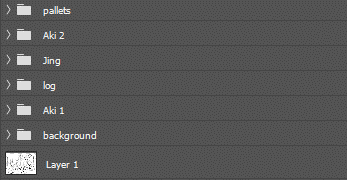
Once all the characters were complete, I moved onto the background. Keeping things on the simple side, I only used one colour for the grass, and two for the trees and leaves. Originally, I tried to give the leaves only one colour, but I found that the image didn't have any depth, so I added it in.
Another thing I added was a log for the ninja to be tripping over, as to convey how clumsy he really is. There are also shadows underneath the two ninjas so that they don't look like they're floating on nothing.

This is the final image. This turned out just as I expected. the only thing I would change would be the scale of the kitsune, which I feel is too big, and unproportionate. Other than that, I'm proud of how little time this took me, as it meant I was able to get it out the way quickly and work on other things.
As drawing is one of my strongest skills, I felt it was only right to pay more attention to the cutscenes, which was something I organised in the project.


Comments