Synoptic Project - Cutscene images part 2
- jesskesson
- May 1, 2020
- 4 min read

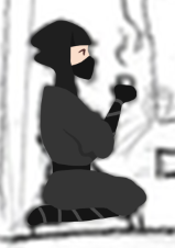
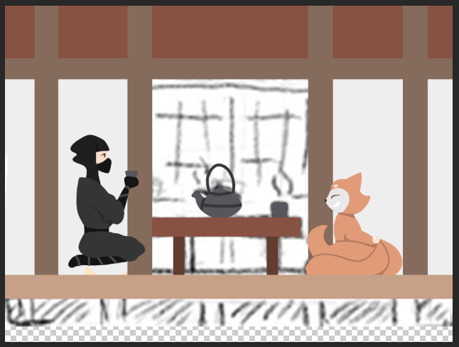
The next image for the cutscenes I decided to make is a zoom-in of a dojo where Aki and Jing are talking and drinking tea. Because it's the second image that will be used, I decided to make this one before the others. It's also different than the other images, as this one takes place inside a building rather than outside or being a visual representation of characters.

The first thing to do was get the image up to the right size. Unfortunately, since I drew all the drawings on one A5 page, the quality is bad, and they are full of inaccuracies. However, some of these inaccuracies work in my favour, as lines are over exaggerated and simple.

Once I'd sized it up in Photoshop, I downloaded the colour pallets I'd already created so that I could keep consistency with the rest of the art.


Much like with other images, I always work on Aki first, as he is the more complicated character to create. I didn't have to do a lot of shading for this one, because the only part of him that overlaps with another is his arm over his chest. I'm not entirely happy with how his legs turned out, as they aren't completely straight. Once I add in the cushion he's sitting on later, it looks better.
Jing is a lot simpler than Aki with her colours and design, but it's harder for me to draw her, as I'm not good at drawing non-human characters. The shading I did on her tails is something that could've used some revision, but overall, it doesn't distract from the rest of the image.

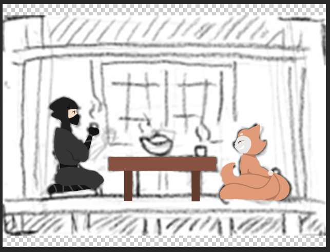

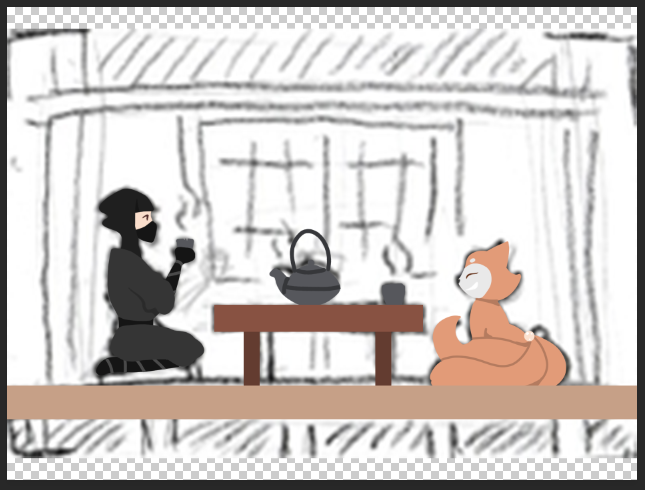
I started working on the table between them now. I used the marquee tool to make precise polygons for the table. I also do this later when creating the background. Japanese tables are also square in shape, so the simplicity I used here isn't inaccurate.
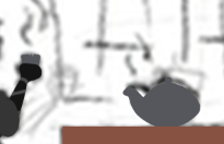
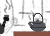
I also made a tea set. I was originally going to give the teapot a handle on the side, but then I realised it didn't read as a teapot, so I gave it a handle on the top, and curved the spout. Although I feel I've changed the design of it too much, it reads much better as a teapot now. I also added a small chip in Aki's cup to further his personality as a clumsy ninja.


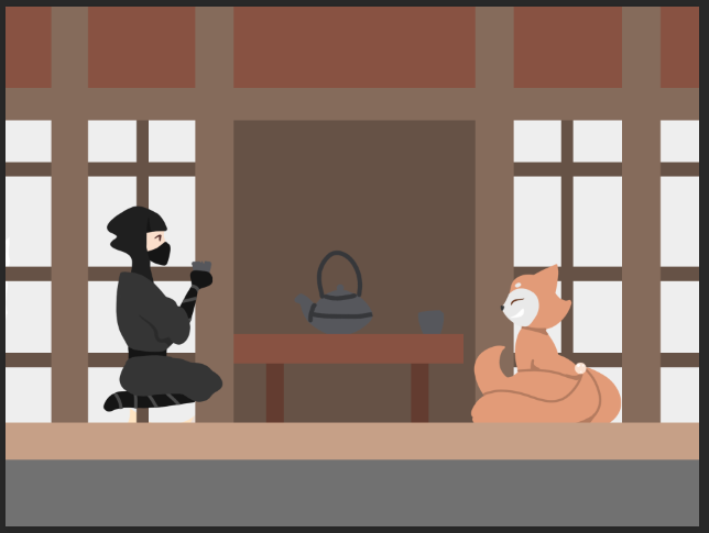


Onto the background, I tried to create the appearance of a dojo, while also not using too many shades to distract away from the scene happening. I added a floor (which is the top layer) and support beams with the marquee tool. In between the beams, I painted it to simulate the paper or silk used. On the top level of the support beams, it's made of vertical wooden planks. I made this as simple as possible, while also trying not to make it dull.
The centre panel is wooden, and has three strips of paper down the middle. These having something written on them in real life, but because I cannot write in Japanese, as it would look convoluted, I left them blank.
In each of the paper/silk sections of the wall, I added more of a skeleton to walls to make sure they looked like screen doors. Also, under the floor is grey to look like the stone that was used to make the foundations of a house. Because the original mechanics I thought about for the game were sneaking above and below certain rooms, I felt that I should put it in to complete the picture.
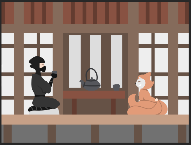
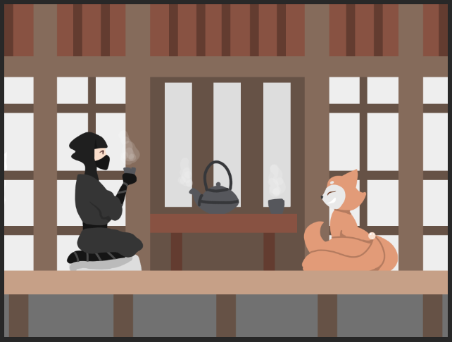
The final things I added was the cushion Aki is sitting on. It was too similar to the colour of the walls, so I added a bit of shading to differentiate the two elements. I also put stream over the cups and the teapot, so it can be inferred that they are actually drinking tea, which can be hard to notice because Japanese teacups didn't have handles.

Overall, I think this image is different from the others. I worried that the setting of this image would make it too distracting, but I've found that the decisions I made about the background made it almost feel silhouetted, and that the characters are the main focus.
Once again, there are a few issues with the scales of characters and objects. For example, I feel the Jing is still too big, and teapot is also too large to be functional. However, I feel that if I made the teapot any smaller, it would be harder to infer what's going on the scene.

This is the finished image. I really proud of how this turned out. The only thing I would really consider changing is how the background is positioned, as it is slightly lopsided. This thankfully isn't obvious at first glance, but the centre of the room is to the right of where the table is. Whether it's the table that needs to move, or the background, or the characters, I couldn't work out, so I left it as is.
One thing I did very well is conveying personality. Jing is still smiling, and Aki is trying to sit down sensibly, as to not break anything. However, his cup is slightly chipped. I was tempted to add a bit of spilt tea on the table, but the 2D perspective made it impossible. We can only imagine what the table looks like, unfortunately.
I think this image is more interesting than the first image I created for the cutscenes, as this one has a more detailed and varied background. It was a nice change from the forest and gradient backgrounds of the other cutscenes.


Comments