Synoptic Project - Cutscene images part 3
- jesskesson
- May 1, 2020
- 3 min read
As the second image to be set in a forest, this one was a lot easier to create, as I already had all the colour pallets I needed. This is also the first image from the second cutscene, which is far shorter than the first, and uses some of the same scenery.

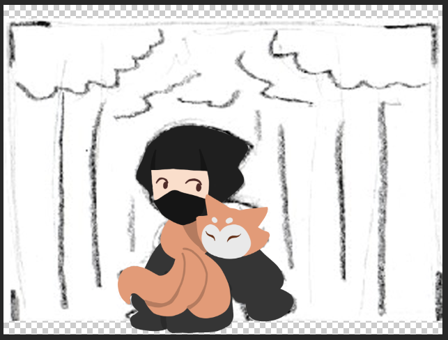
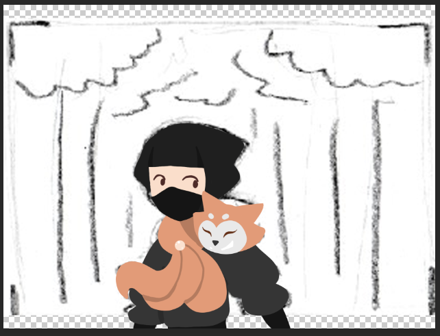
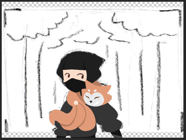
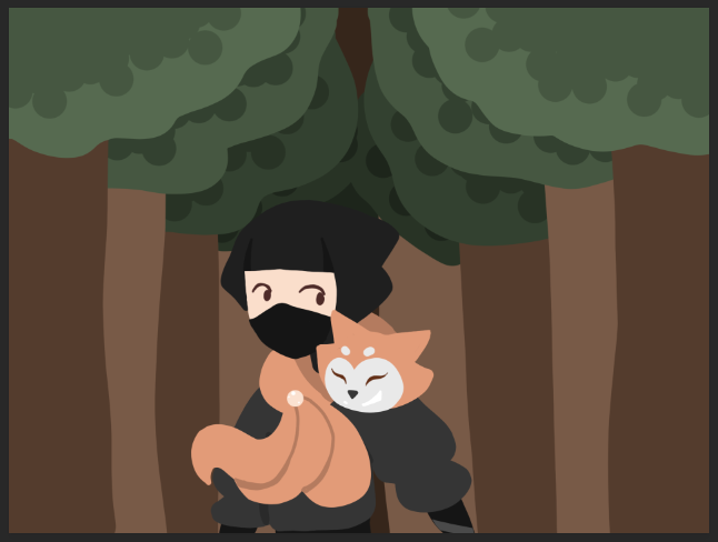
The image is of Aki walking through a forest with Jing on his shoulder. In the scene, they are discussing where the next piece of the robe is, and Jing explains the challenges they will face. I didn't want the scene to look too serious, so I decided to keep Jing's cheeky expression to keep things light.
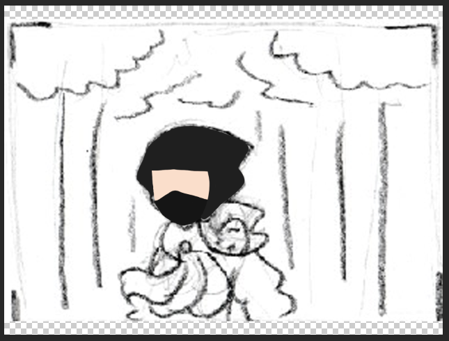
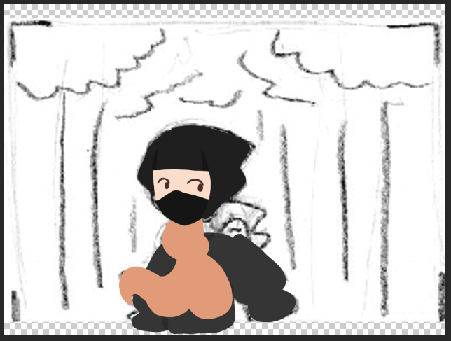
While creating Aki's head, I realised that both characters would have to be made around each other, which presented the challenge of creating two characters at the same time. This is something I don't usually do, as I like to keep my workflow simple by working in a linear pipeline. However, it was fun to try a new way of working for a change.
In this image, I feel like I finally got the scaling between Aki and Jing correct. She seemed over-sized in previous images because of the size I originally drew them at. Because her pose was also a problem in other images, I made sure to give her a back so that it looked like she was curled round his neck.
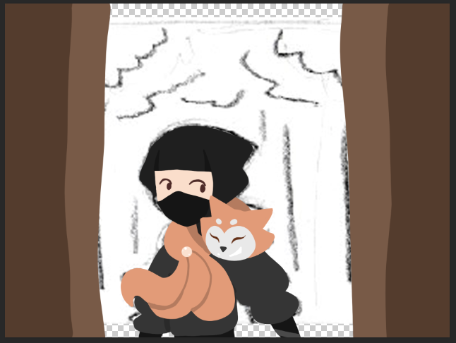
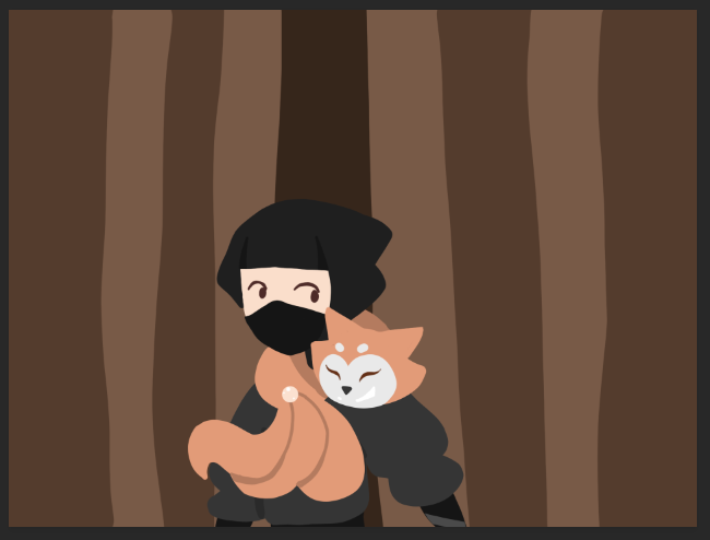
After I'd finished the characters, I moved onto the background. I decided to try and give the image a bit of perspective, so I made stripes of brown on different layers, moving to the centre. I chose a darker brown for the centre tree so that it seemed darker and further away.
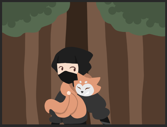
I then started creating the leaves for the trees like the first pan, and went back between the layers to create a bit more depth. I progressively made the leaves darker, which created a story-book effect. It reminds me a lot of pop-up books, and also of shadow puppetry, which is when cutouts of characters with movable limbs are put against a screen to tell a story. It also reminds me of a stage set, where the backgrounds are flat to make way for the stage wings. This wasn't the effect I was originally going for, but I think it's pleasing to the eye.
I added a sky to add a bit of light to the composition, as the centre was a bit dark. I debated whether to add lighting to the image, but I decided that that wouldn't match the rest of the images. I instead added a small amount of shading behind Aki, so the grove of trees looked a bit darker behind him.

I added another layer of shading to reach the trunks of the trees, as the flat shading didn't work there. I found that I had to make this new shading layer very faint, otherwise it overpowered the rest of the image.

This is the finished image. I'm proud of this one, as it made me consider and try a lot of new things. I worked non-linearly on the characters, made me think about the balance of the composition, and also got me to use shading, something I haven't done in the rest of the images.
The only thing I would change about it is the lighting. Although I did my best to balance out the image, I still think it's too dark. However, I think the darkness of the image gives it more depth, and also helps tell the story. Aki and Jing are both determined to go through with their mission, while the dark forest shows that things aren't as easy or happy as they seem. This wasn't something I intended for, but I like the contrast between the happy characters and the daunting woods.












Comments