Synoptic Project - Cutscene images part 5
- jesskesson
- May 7, 2020
- 6 min read

The fifth image for the cutscenes is the second most complicated. It features in the second cutscene, when Jing is telling Aki about the rest of Chan's teammates, the Four Senshi of Mount Fuji.
The Four Senshi of Mount Fuji are some of the antagonists I designed for the Synoptic Project. There are others apart from them, but they are the ones that are mentioned in the scripts I wrote for the separate levels.

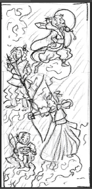


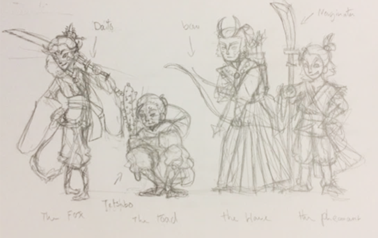
This image is based heavily off of the painting I used as inspiration, which depicts a fox flying through the air with a toad, a hare, and a pheasant. I decided to copy the overall layout of the painting, which I thought was a good way to show all the enemies in an upward pan.
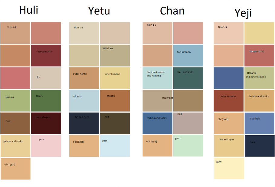
I also prepared colour pallets for each of them, which helped a lot. Their designs are an amalgamation of Japanese and Chinese clothing. As I decided the designs of spirits would be more Chinese in nature, it felt better to have these characters in a few Japanese garments as well, since their origins are Japanese.
I decided early on to cut Chan out of the picture, as when this cutscene is shown, he's already fled away from the player, and is now no longer a threat. I felt that the image felt over-crowded with four characters there, so I felt removing him was the best thing. The characters are also positioned further up from each other according to who is more powerful. Huli is at the top, followed by Yeti, then Yetu and Chan. There is a separate post explaining all about the different characters I created for the Synoptic Project:


The first character I decided to make was Huli, who is at the top of the image. I had to make sure his profile would stand out against the moon, so I made his mouth wider than I originally planned. I gave him some makeup to look more like what I intended. As he is also a fox spirit like Jing, I used paintings of kitsunes in their 'human forms.' Most of these were of beautiful women, so I decided to give him more feminine features.
His headdress was something I also got to design during the creation of this image, as I hadn't drawn Huli from the side in designs. His hair was a tricky thing for me to work out. I was worried that by adding different shades to define cowlicks in his hair wouldn't look right. However, when used sparingly, it gave the affect I wanted.
After I'd finished with Huli's head, I moved onto his clothes, which are more Chinese in design. The top layer is a hanfu, which means the cuffs are different, and it is more tailored towards him. It's also less square, which allowed me to give him a different silhouette than the other two. One of the most important parts of this image was showing the individual personalities these characters have. As Huli is flamboyant and confident, I tried to give him an arrogant position above the other two. I think this helps demonstrate both his position as the leader, and his cocky persona.
I also had to keep in mind the physics and movement of the clothing, as they're flying through the sky on cloud. This meant I over exaggerated everything to look bouncier than it usual would be. His hakama (trousers) were something I think I handled very well, as I knew it would be easy to make them too baggy.
One thing I changed about his design was the weapon he carries. It was originally meant to be a katana, but I changed it to a jian, which a Chinese sword. I felt it was more ornate and fit his style better.


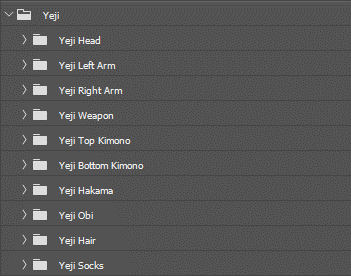
The next character I worked on was Yeji, who is based off a pheasant. I gave him some markings on his face to look more like the animal he is supposed to represent. His nose is also yellow to act as a beak. I tried to make him look confident as well, so I exaggerated his eyebrows and gave him a lopsided smirk.
His clothes were more complicated to work out than Huli's, as I had to work across multiple layers for his arms. This is because his weapon, a naginata, had to be above certain layers, and below others. This meant that I had to break the arms into two layers.
One of the things I did wrong with Yeji was over exaggerate his clothing more than his hair, which isn't visibly being affected. When I drew it on paper, I did sway it to the side, but because of how I drew his hakama, it no longer has any movement. I wish I had tried to re-work this, but overall it doesn't affect the composition.
The rest of Yeji's clothing was simple enough to add in. I added some blue feathers to his sleeves and hair to give him more 'bird-like' qualities, as I felt that it might be a bit confusing what animal he is supposed to be. I think I put too much detail on the feathers, as they jump out for having intricate lines.


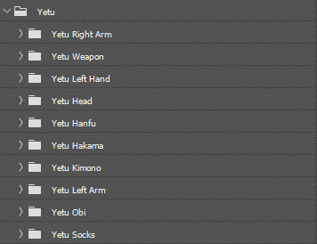
Next I worked on Yetu, who I also had a few problems with. I redid his face's profile a times because I disliked it. I was in a debate with myself over what sort of nose to give him, as I wanted him to look the most serious out of the three. I went with a straight nose, which I ended up softening down a little later to balance out how everything was positioned on his head. I gave him two flicks of hair to simulate a hare's ears, which is the animal he represents.
I gave him marks on his face to look like whiskers, which I thought would make him less intimidating, but it doesn't actually have an effect. I was most worried about Yetu's design, as his character is supposed to be stoic, and not at all like a hare is usually imagined.
His clothes are mostly Japanese apart from on thing. I gave him a sleeveless hanfu on top of his kimono, which has a stood-up collar and shoulders that point upwards. Unfortunately, I couldn't find a good way of showing their two traits of the hanfu because of his pose, so it basically looks like another kimono. I also gave him a necklace of wooden beads, that would be worn along with a 'hoshi no tama.' A hoshi no tama is something that in mythology only kitsunes had, but I decided to give one to each spirit. I thought it was a good way of identifying characters, as all they have to do is look for a gem on a character.
Yetu and Huli both have their hoshi no tama on necklaces, whereas Yeji has his in his hair. I tried to make sure these were as unobstructed as possible, but sometimes they did end up blocked from view. This happened with Yetu, as his hand is drawing an arrow back on his bow. His bow was another worry for me, as Japanese bows are taller at the top. I had to make sure he was positioned so that he wouldn't obstruct any of the other characters.


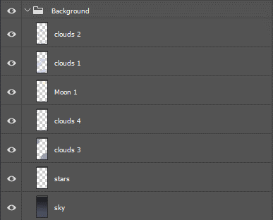
The background I created is a simplified version of the original painting. I originally wanted to do a different background, but I felt that I had to keep to the idea of mirroring the original painting.
I added a gradient to the background, then dotted around with white to create stars. I only added a few because I didn't want to overload the composition. I added in two layers of clouds, which I also added swirling detail onto to mimic Japanese styles of lining. I didn't want to add too much detail into the background, so I didn't shade the clouds in any way.

Overall, I think Yeji turned out the worst out of the three, as his clothes are too exaggerated and make the rest of him stand out for not being exaggerated. I think Yetu turned out the best out of the three, as his pose is dynamic and explains his personality perfectly.
I would've liked to have added Chan, but it didn't seem right, as the cutscene this image is in plays right after his defeat/ flee. I think I made the right decision, but it leaves the bottom corner of the image very bare. I think I should've repositions the characters with my decision, but since this image will be an upward pan, I think it still has the affect I was going for.


Comments