Synoptic Project - Cutscene images part 6
- jesskesson
- May 7, 2020
- 9 min read

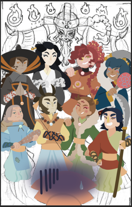
As the final image for the cutscenes, it's the most elaborate and complicated as it incorporates a total of eight characters, which have been explained in a previous blog:
This image is featured in both the first and second cutscene, so originally I was going to do two versions of it. One with the emphasis on the bottom row of characters, with the others all in silhouette. However, I decided against this, as I felt it was important to establish the villains a player would face if the game was complete.


Because there were so many characters to keep track of, I had to keep their designs open at all times. In the original image, there were characters I didn't even have colour pallets for, so I had to make those.

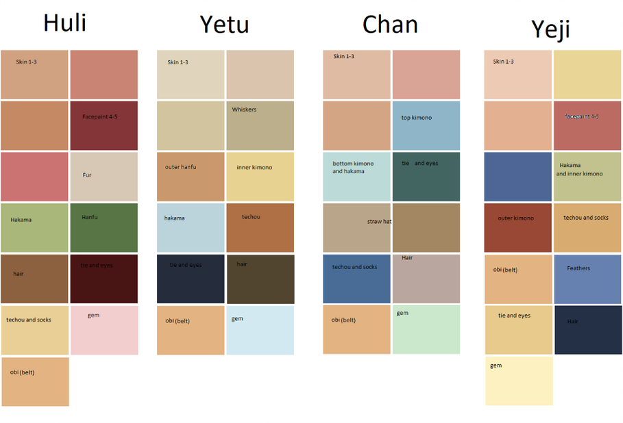

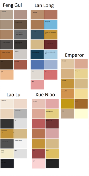
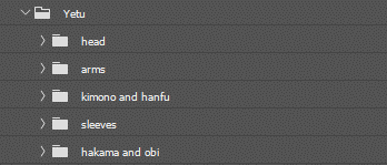
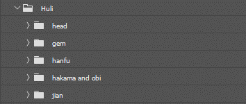
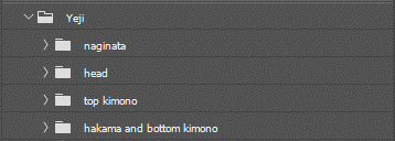
These are the colour pallets I made for each of the characters. The pallets for the first four characters, Huli, Yetu, Chan, and Yeji were already made, so I didn't have to worry too much. However, the second row of characters didn't yet have solid colour pallets, I made them some.
I tried to keep to their respective animals, and found that it was easier to give them unique pallets because I wasn't working from a painting, and more from my imagination. They also have far more Chinese centred designs than the first four, which made them more complicated to design.

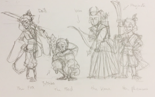
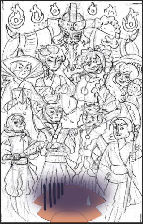
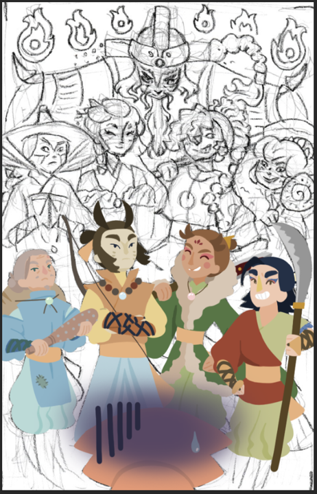
Before I got to doing any of the enemies, I placed Jing at the bottom, peering up in fear at all her adversaries. I wanted her to be at the bottom, with all of them leering down at her. This was to demonstrate how powerful they each are. The higher up on the picture they are, the more dangerous they are. This is why the Emperor of the Spirits is positioned at the top, towering over all the others.
I communicated Jing's feelings in a more cartoony way than I originally planned, as her face isn't visible to show emotions. I added a sweat drop and a dark cloud over her head to demonstrate how hopeless she feels by herself.


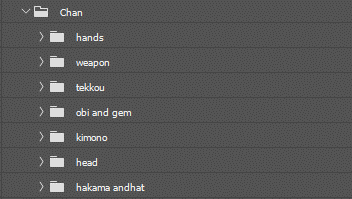


Once I'd finished Jing, I moved onto the Four Senshi of Mount Fuji, the first row of villains. I started with Chan on the far left. I had a bit of trouble getting his hair and face right, as he's looking at an upward angle, and there isn't an easy way to describe this while using simple colours. The main issue with his hair was that his cowlick is in an awkward place. I thought about flipping it to the other side, but I decided to keep it where it was.
Chan's weapon, a tetsubo (testu = iron, bo = rod), which is a type of kanabo, was another thing that took me multiple attempts. I had a hard time getting the shape of it right, as well as the scaling of it. didn't want it to be too big, so I drew him as if he was hitting the tetsubo against his hand threateningly, which is somewhat out of character. However, it gives a good representation of the sizing of the weapon, whish wasn't meant to be too big.
Next, I worked on Yetu. I had a hard time with his arms, which were crossed over. This meant I had to use multiple layers and colours at the same time, which got highly confusing. It turned out well in the end, and I'm glad I didn't accidently make his arms too bulky.
The pose Yetu's in made it easier to show his full design, unlike the previous image, which abstructed some features of his outfit. Now his orange hanfu is in full view, and you can see the lifted shoulders and collar. I think this adds a bit of uniqueness to his design, as in the previous picture he looks very Japanese because of the hakama trousers he's wearing.
Next, I worked on Huli, who has the most interesting pose to suit his personality. He almost looks like he's strutting, which I find amusing, since it would be very in-character for him to be. Unlike the previous two, he's smiling. I also kept his eyes closed, as I thought it suited him more (it also made it more clear that he's a kitsune like Jing, as her eyes are always closed as well). I also gave him more makeup in this view of him, since it wasn't as striking as I'd hoped. I gave him a crest on his forehead, which is a Chinese element I added to him.
I had trouble with Huli's hair, as the headdress he has isn't something that is easily translated to an upward view. It still doesn't look right, but since it isn't the focus of his design, I let it slide. Another thing that definitely isn't right with Huli is his sword. The hilt and blade don't quite line up, but it isn't all that visible unless you're looking for it.
Yeji was an interesting case, as I started creating him while still working on Huli, as the sleeves of his hanfu took up a lot of room. Yeji's face was a lot easier to make than some of the others, but his mouth was one of the problems. It took me quite a few goes to get his moth the right shape and size, as I wanted him to balance out the serious side of the group with a light-hearted smile. This smile is appropriate, as Yeji tries to imitate his teammates a lot, and is always enthusiastic.
One thing I couldn't prevent with Yeji was the covering of his gem. I wanted his weapon to be in the image, but this unfornately meant his gem in his hair got covered. I was tempted to remove his weapon, but as the other three all held weapons, it made him stick out too much. He also looks too friendly without a weapon, so giving him his naginata was almost essentially for him to be viewed as a villain.
Something that I did with the Four Senshi of Mount Fuji was coordinating their outfits. Each of them has a matching orange obi, which was something I originally drew them with. I felt that with all of their unique designs, it was easy to forget that they are a part of a team so I made all of their obis the same orange, regardless of the rest of their pallets.


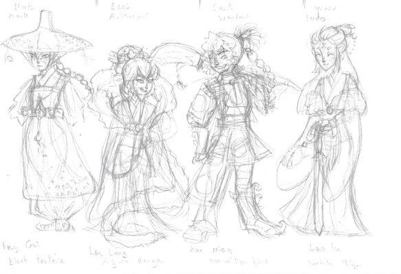
Once I'd finished the first row of enemies, I moved onto the second row, which is the Four Tenshi of the Heavens. Unlike the previous enemies, these four don't have any unifying parts of their designs. I felt this was appropriate, as they have more of an array of styles and clothing. The mythology behind these four is also different than the previous four, so I felt it more fitting if they didn't match each other.
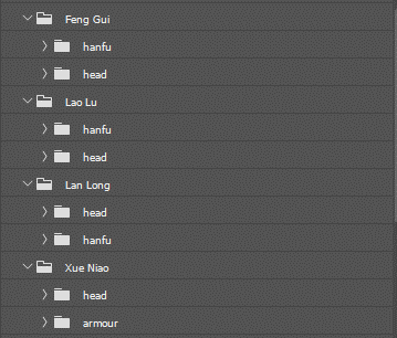
The first person I worked on was Fang Gui, who represents the Black Tortoise of the North. I decided to go with a stoic, religious pose for her, as that is part of her character. I originally wanted to give her the robes of a Buddhist monk , but I decided against it, as it didn't match the style of hat I gave her, which is inspired from Korean designs. I wanted her clothes to look similar to a hanbok, the clothing in Korea. The skirt of her hanfu-hanbok infusion is called a chima, which I cut shorter in her design.
In mythology, there is a snake that is coiled around the Black Tortoise. I was tempted to add this element, but I decided against it, as her animal was already confusing, and adding another would only add to the confusion. Something that didn't look quite right about her was her hat. It was slightly lopsided from the angle, and the ribbons that tie it to her chin aren't quite on opposite sides.
Next is Lao Lu, the White Tiger of the West. The colour pallet I chose for her was hard to come up with, as I didn't want her to be drowned out by the colourful characters around her. I decided to give her some creams and golds to add a bit of colour to her, and it luckily didn't overload her design. I gave her a simple hanfu and a fur cloak, which I decided to put markings on to convey what species she'd meant to represent.
Although it's hard to see, I place her gem in between the two sides of Lao Lu's cloak. I also had a long debate when making her pallet what colour her hair should be. I originally wanted it to be white, but I knew she would just end up being entirely white, which wasn't something I wanted. I decided on black hair for her, as I felt that was the only way for her character to be a prominent part of the image. She still manages to slip under the radar, but this is fitting for her character.
The next character I created was Xue Niao, the Vermilion Bird of the South. Unlike the previous two, I had a hard time colouring her outfit. I gave her Chinese-inspired armour, which ended up as orange with red accenting. In real life, the embroidery and designs on armour is far more elaborate. To keep to the simplicity of everything else, I toned it down.
Something that was complicated about Xue Niao's design was the fact that I was giving her masculine clothing, while also having to make her a fierce woman. Her hair was my favorite thing to make, as it was both contained and bouncy, which gave it an interesting shape. The only problem is that the feathers in her hair are too similarly coloured to her hair to have the impact I had hoped for.
Finally, I moved onto Lan Long, the Azure Dragon of the East. Her clothes are the most elaborate out of all of them, as I based her outift on what the aristocracy would've worn. the cuffs of her outermost hanfu is golden, which I put in full view. I wanted it to be clear that she's the type of person to flaunt her wealth. She's holding up an uchiwa, which a type of Japanese fan. Although it doesn't seem it, this is the weapon I decided to give her.
I also gave her scales on her face to try and show that she's a dragon. These scales would also be running up her hanfu's skirt as decoration, which was unfortunately something I couldn't add into this image. I tried to give her a different face shape than the others, that would also demonstrate that she is the youngest member of the group.

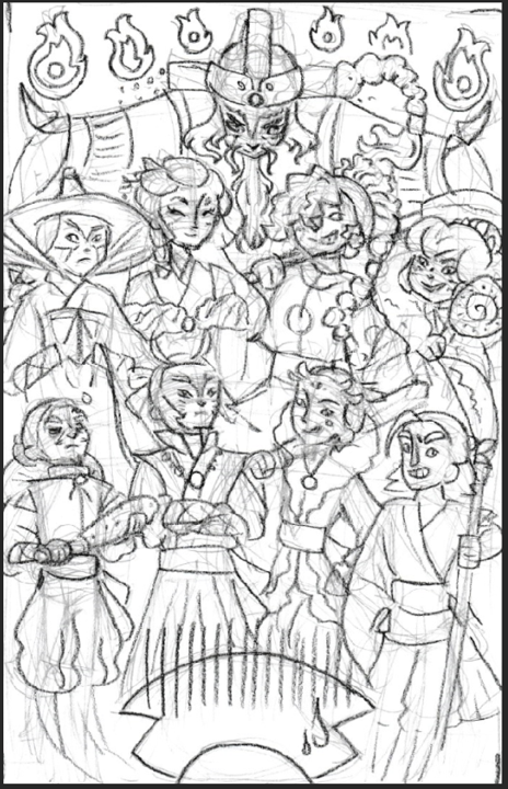


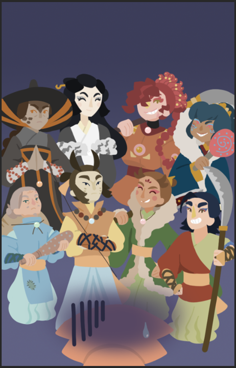


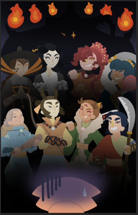
The progression of this image was done linearly, as I didn't want to start working on a character from the second row while still on the first. Once Jing and the eight enemies were completed, I started working on the background.
I added a lilac gradient to the background layer, then added black in front of each row so that they blended into the background. I wanted them to seem unreal, as if Jing was imagining them all looming over her. The shadows over them conveys this nicely. I also added more shading over the Tenshi in the second row, as they are more unknown as a threat, and left unmentioned in the script. This added the mystery I wanted to them.
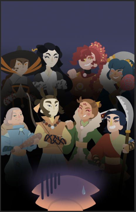
Behind them, I decided there should only be a silhouette of Emperor, as he is an even more unknown threat. This decision was also because his design didn't look right with his pose. I made sure to add the beads that would be attached to his headdress.
To him more menacing, I added another layer of shadows along the top, and a pair of golden eyes above it. Originally, I was only going to have the star on his eye, which is cartoony enough to not be out of place. I decided on adding another one so it was a bit clearer that it's the Emperor of the Spirits.
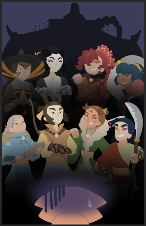
I also added fire along the top to demonstrate how afraid Jing is of him, and how powerful he is. I based these off how fire is drawn in Chinese paintings, and also statues and figurines of Nataraja, who is an avatar of the Hindu God, Shiva. Nataraja, 'the cosmic dancer,' is placed in the centre of a circle of fireballs, which is where this idea came from.

As the final image of the cutscenes, I'm really proud at how this one turned out. It definitely took the longest to create out of all of them, and had me referring back to my designs a lot. There is a lot going on in this image, but I think I found a good 'neutral ground' with the activity.
I really like the parallels I created in the image between characters. Chan and Fang Gui are both the weakest in their respective groups, and both have a somewhat emotionless manner; Yetu and Lao Lu are both highly stoic and protective; Huli and Xue Niao are both in similar poses and the leaders of their groups; and Yeji and Lan Long are both confident and proudly showing their weapons.
The image as a whole looks way better than what I'd hoped for. All the characters share the same cartoony style, and look as though they belong in the same image, which I'm relieved about. The risk I took with having so many characters in one scene was that it would lack consistency.
This is the finished image, and the final image I needed to create for the cutscenes. Unfortunately, these cutscenes may not get to be made because of the quarantine, and I don't have access to programs that could be used to create them. However, it was still a great learning experience to create still images. I learned a lot about storytelling, and how to convey emotions and events without words. This is a skill I want to use more often, as it could still use some work.
Another thing I learned was how to create a background that matches the style of a character. Backgrounds are hard for me to draw, as perspective is one of my weaker skills as an artist. However, I played to my strengths and made the backgrounds simple enough that I didn't need to rely on perspective to get them right.
Overall, this mini project in the Synoptic Project has been my favourite. I got to create images in Photoshop, which has taught me a lot of things I didn't know before about the software. It's helped my confidence in my art skills as well, and allowed me to apply art to something I've written, which is something I plan to do more frequently.


Comments